MyImages Refresh
Role
UX/UI Designer
Scope
Onboarding redesign, workflows, visual refresh
Client
Nexus-MD
Timeline
2025
Overview & Content
Nexus-MD is a healthcare startup focused on improving access to medical imaging. I redesigned the consumer-facing app's onboarding experience and key workflows to create a cleaner, more intuitive interface that helps patients quickly access and share their medical images. The refresh initially targeted the existing web app, and the new design and workflows were then applied to a native app developed later.
Task Flows
1
App Audit
2
Low-Fidelity Mockups
3
Style Guide
4
Final Product
5
Task Flows
While looking through the web app and identifying areas of improvement, I also defined and outlined the three main task flows we prioritized in the refresh.
Task 1: Onboard New Users
“As a new user, I want to get set up in the app as quickly and easily as possible, so I can get access to medical images.”
Task 2: Request Medical Images
“As a user who has received medical imaging, I want to request those images from the site of service, so I have direct access to them.”
Task 3: Share Medical Images
“As a user with medical imaging available to me, I want to securely share those images with medical professionals as needed.”
App Audit
With the task flows in mind, I took a deeper look at the app as it was at the time in order to identify and prioritize issues.

Issue 1: UI Consistency & Quality
Placement and treatment of components are inconsistent. Text legibility and hierarchy across the app is an issue.
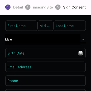
Issue 2: Onboarding Flow & Efficiency
Process is clunky and long. Directions and navigation during onboarding are unclear.
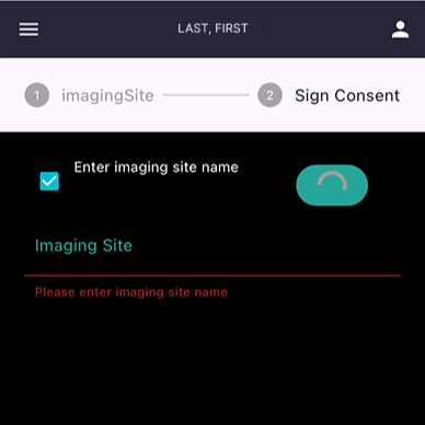
Issue 3: Request Flow Functionality
Directions across pages are not clear. Interactions on pages do not follow expected behavior. Search functionality does not operate well.
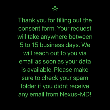
Issue 4: Confusing & Excessive Copy
Language throughout the app is inconsistent, i.e. labels, buttons, etc. Titles and descriptions lack clarity & brevity.
Low-Fidelity Mockups
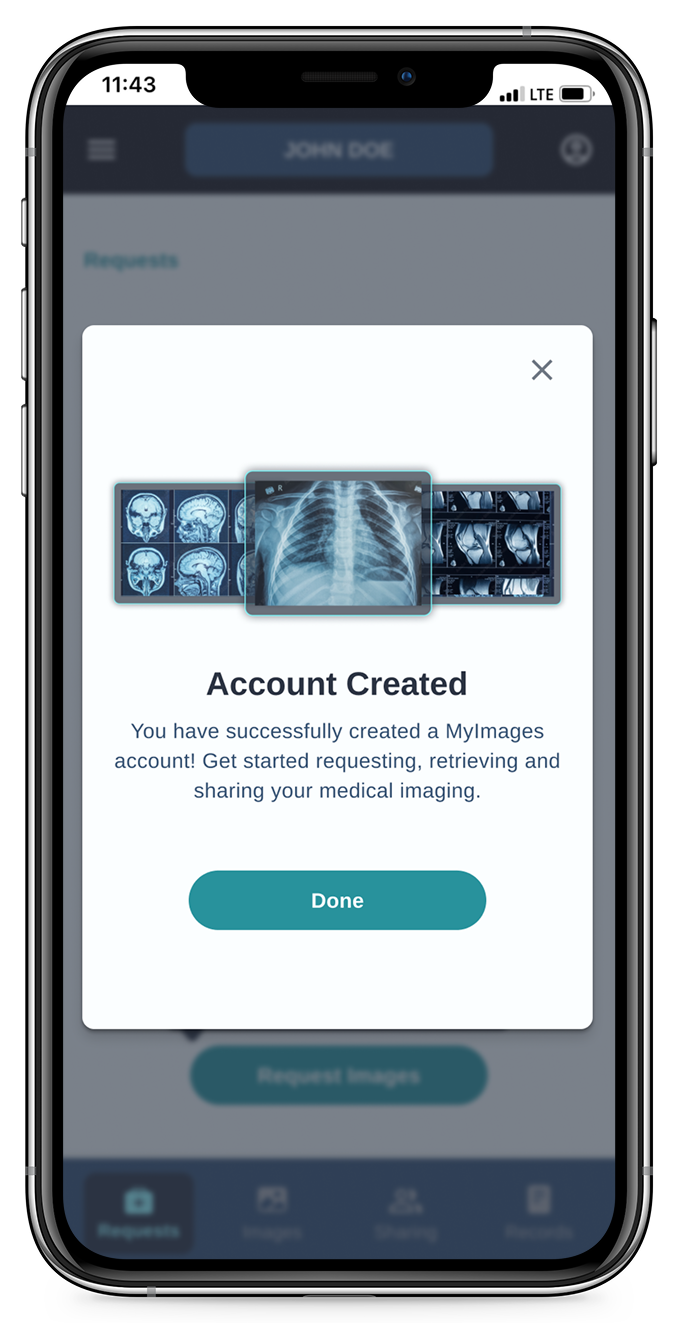
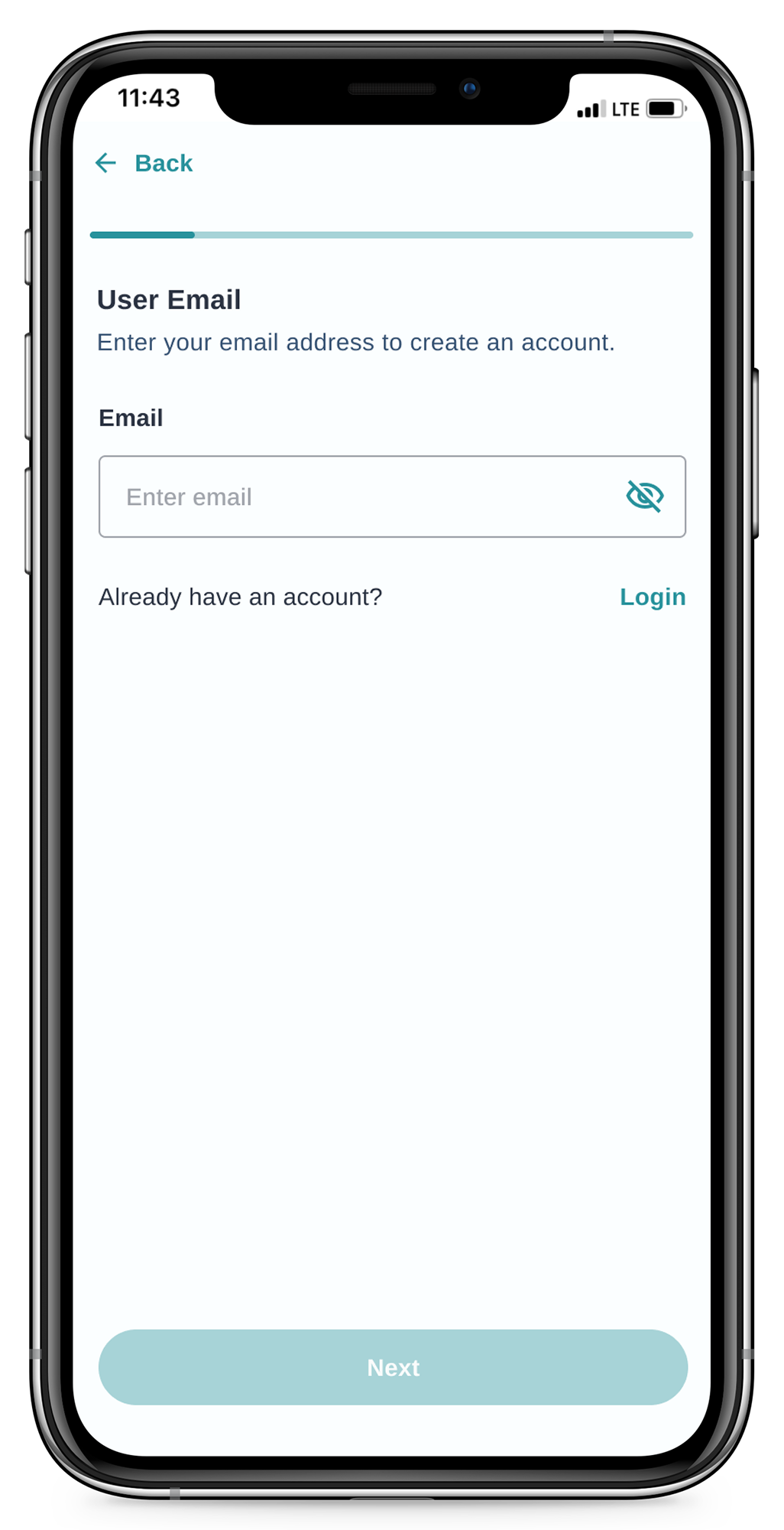
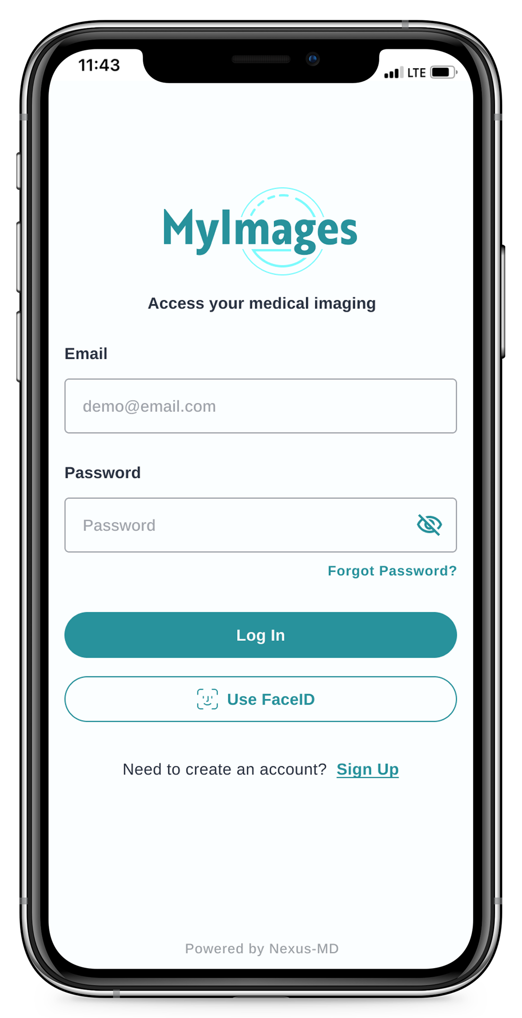
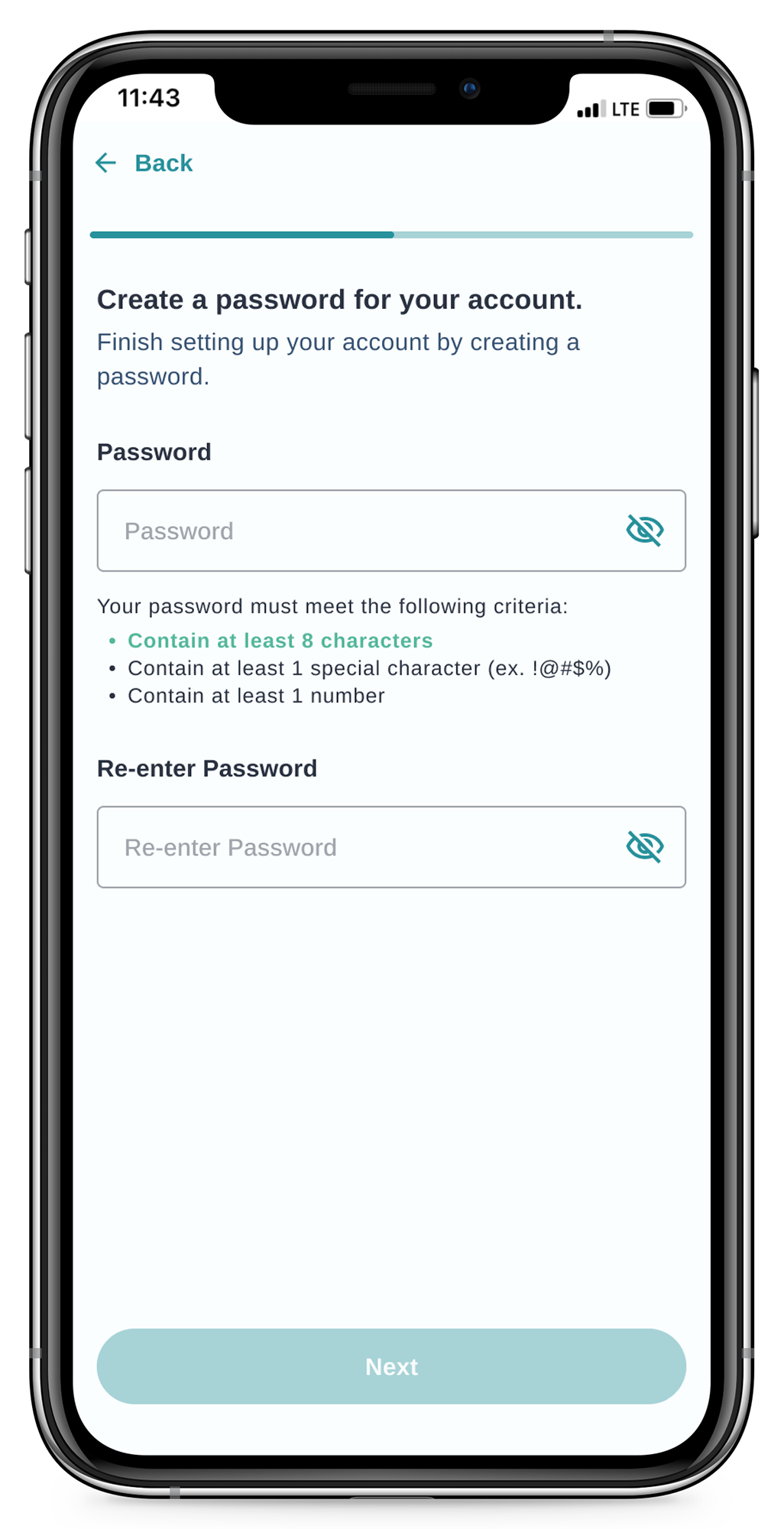
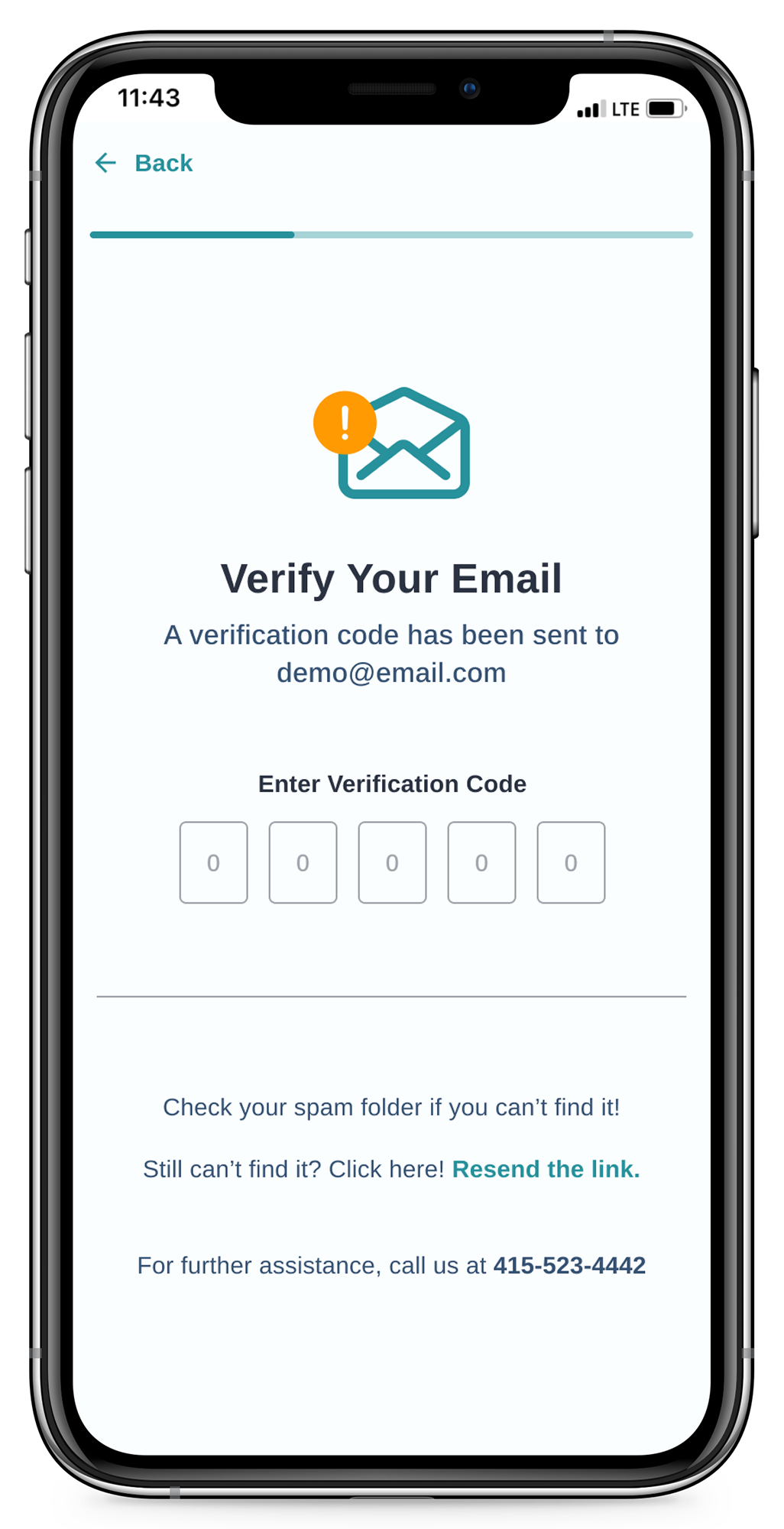
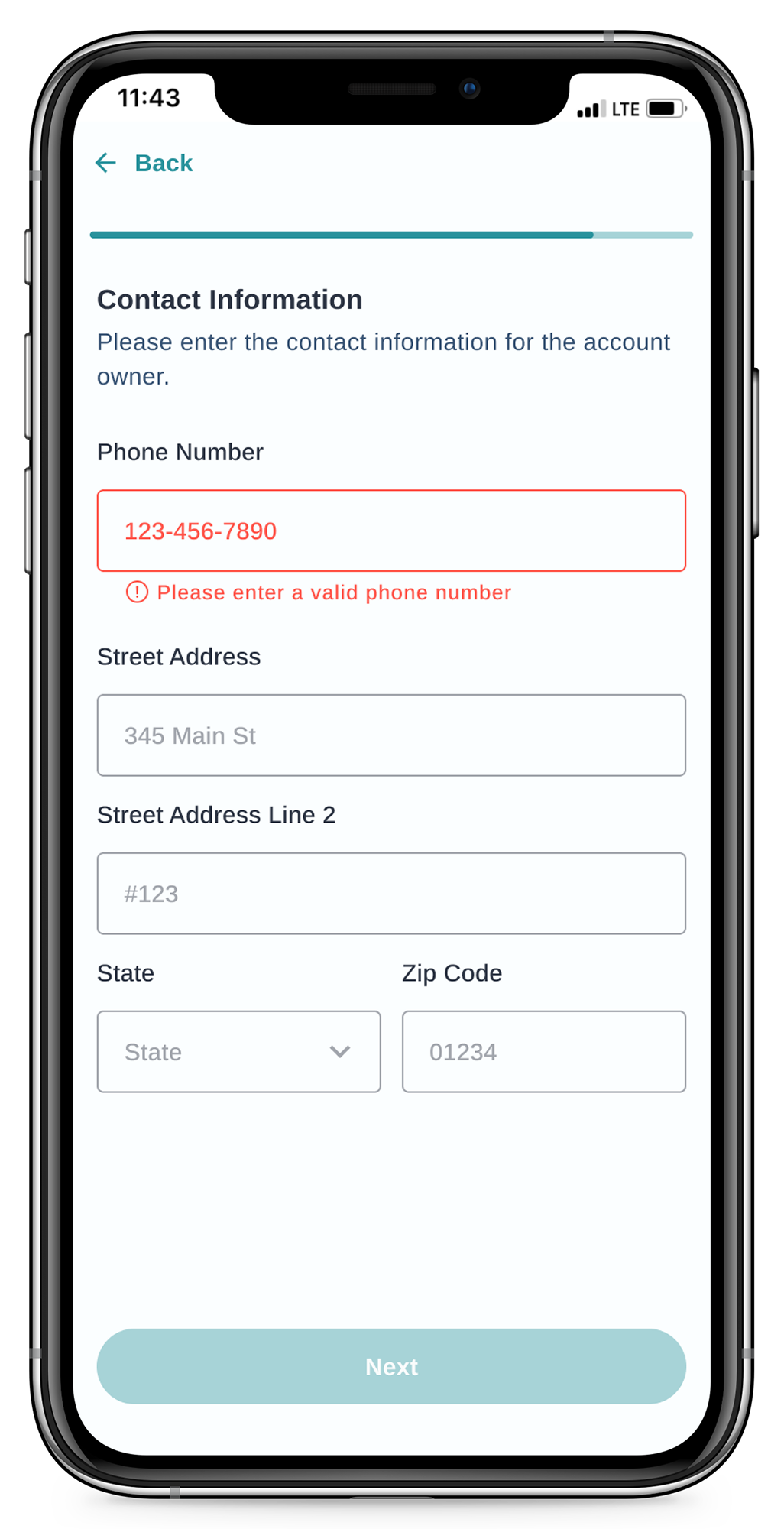
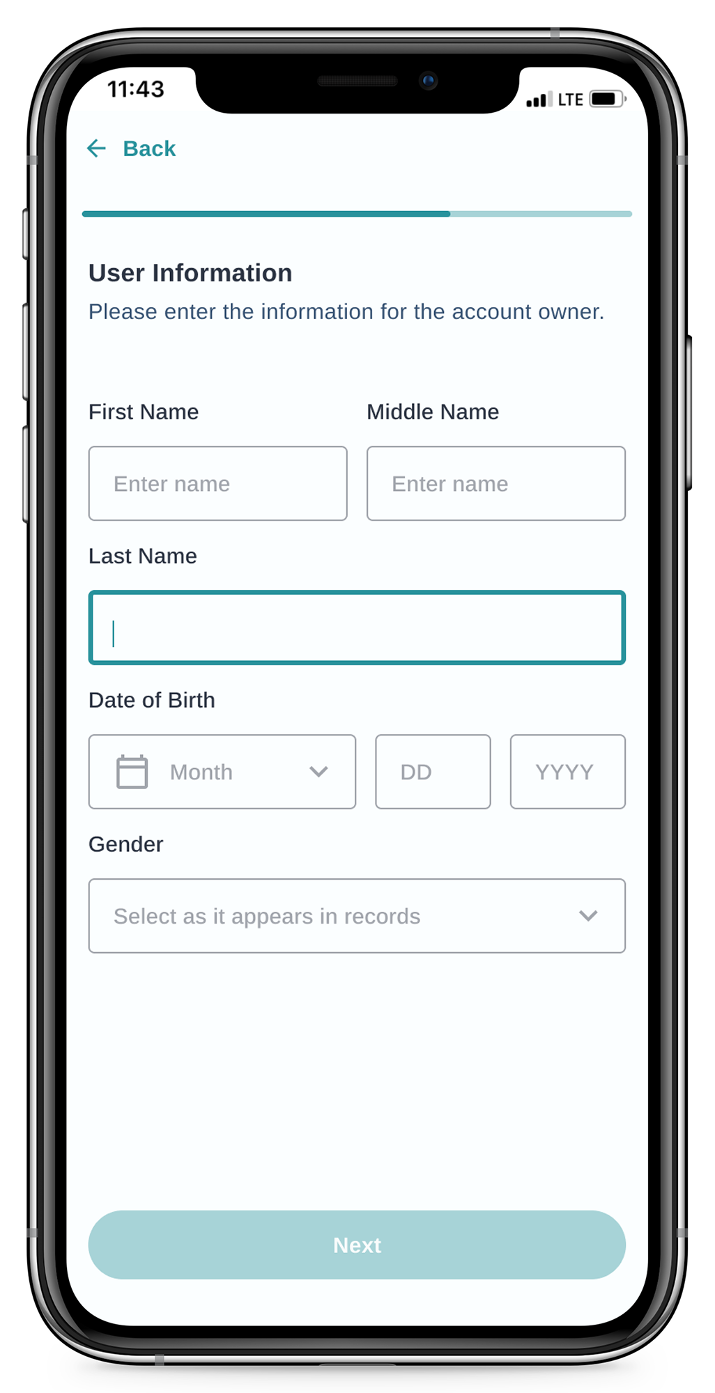
Starting with the onboarding flow, I mapped out the basic structure and number of screens needed for new users. My focus was on creating an efficient, simple workflow, with consistent UI across all pages.
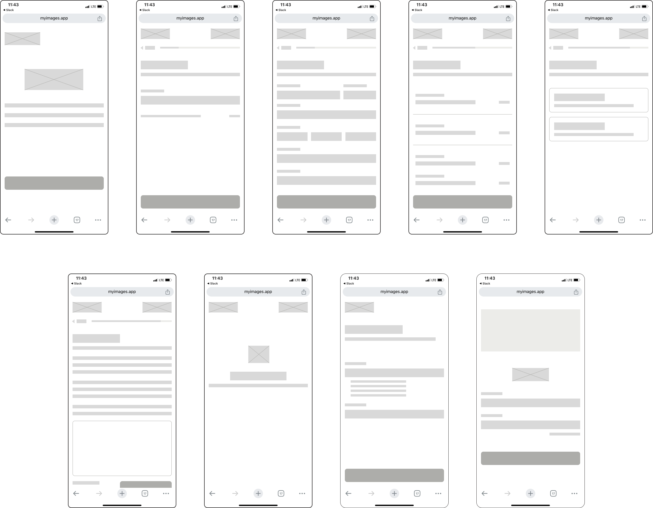
Style Guide
Following the example of many apps in the healthcare space, the aesthetic for the app refresh adopted a light mode, with brand-specific accent colors throughout. I cleaned up components including buttons and icons, and implemented consistent text styles.
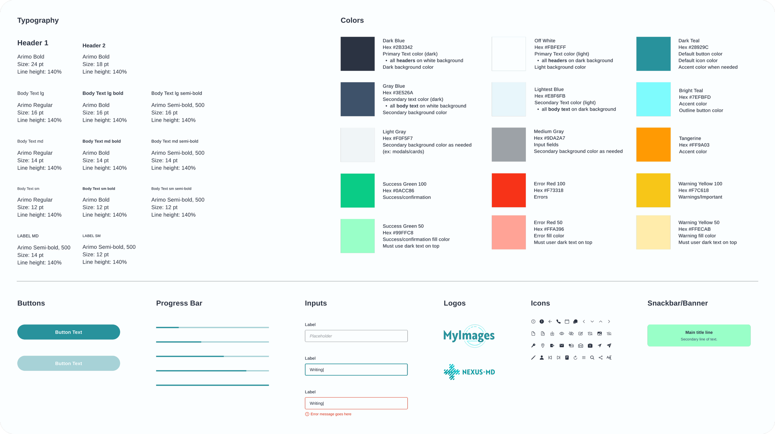
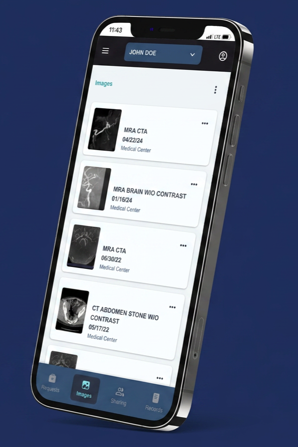
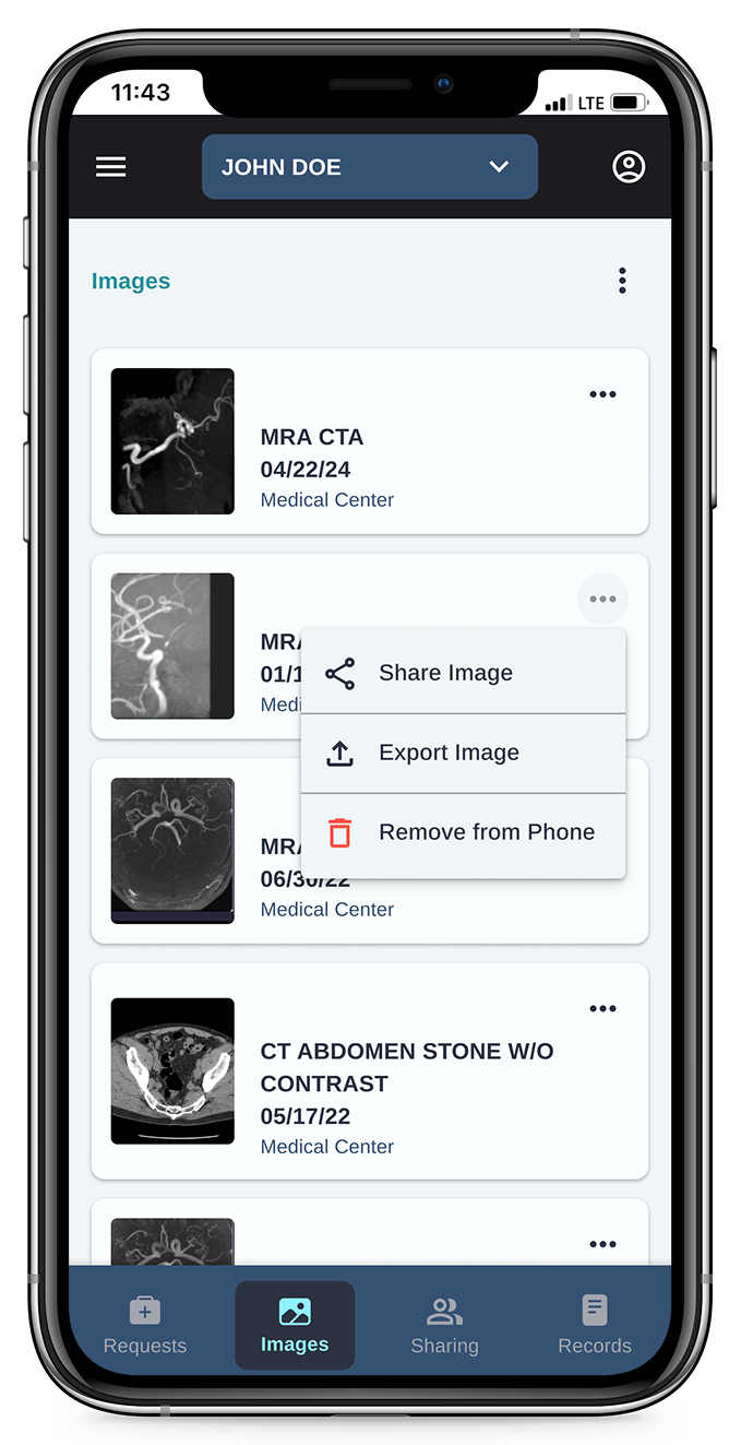
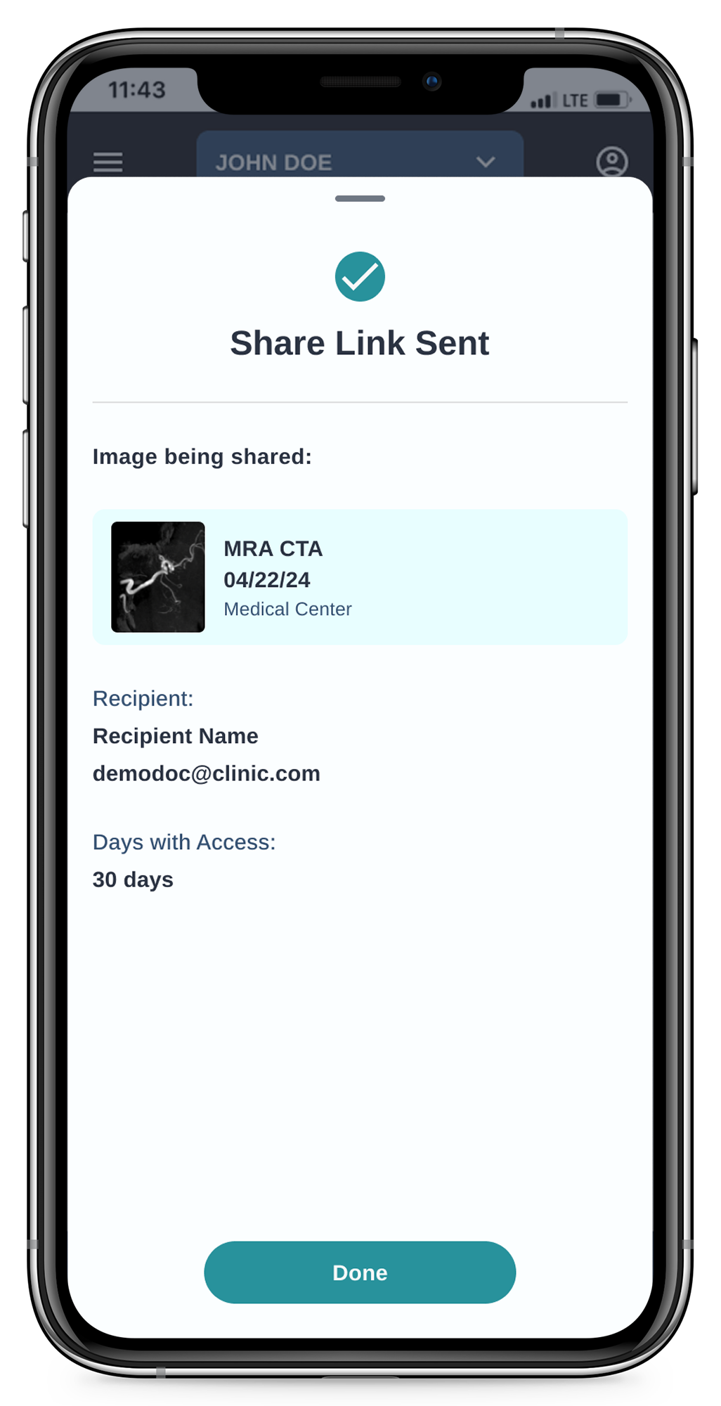
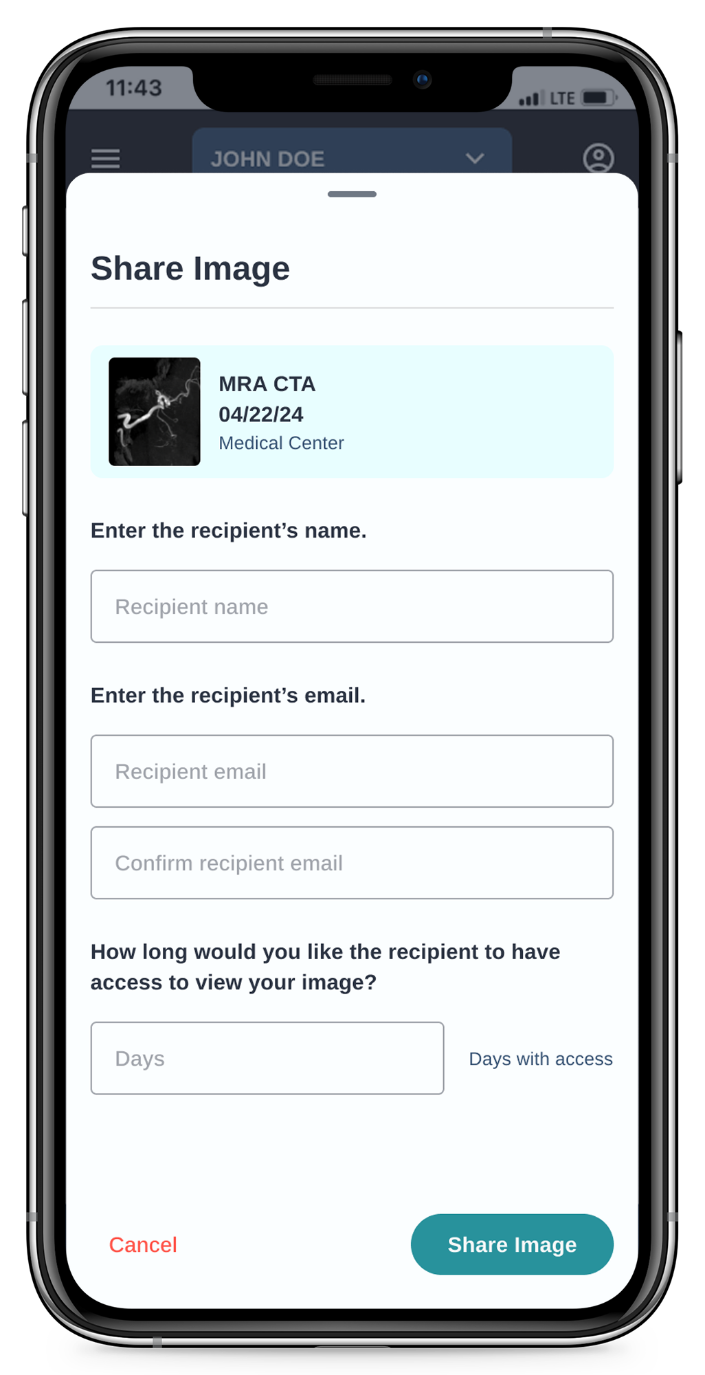
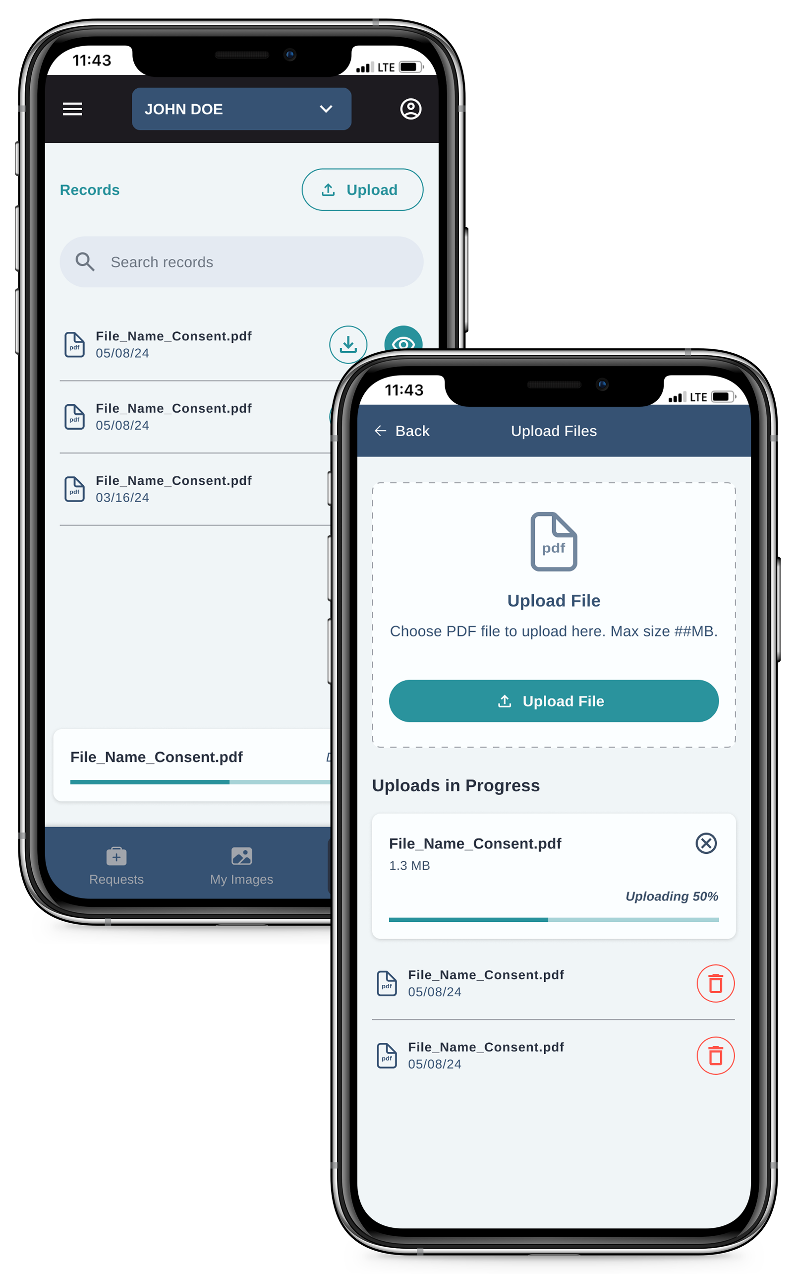
MyImages App
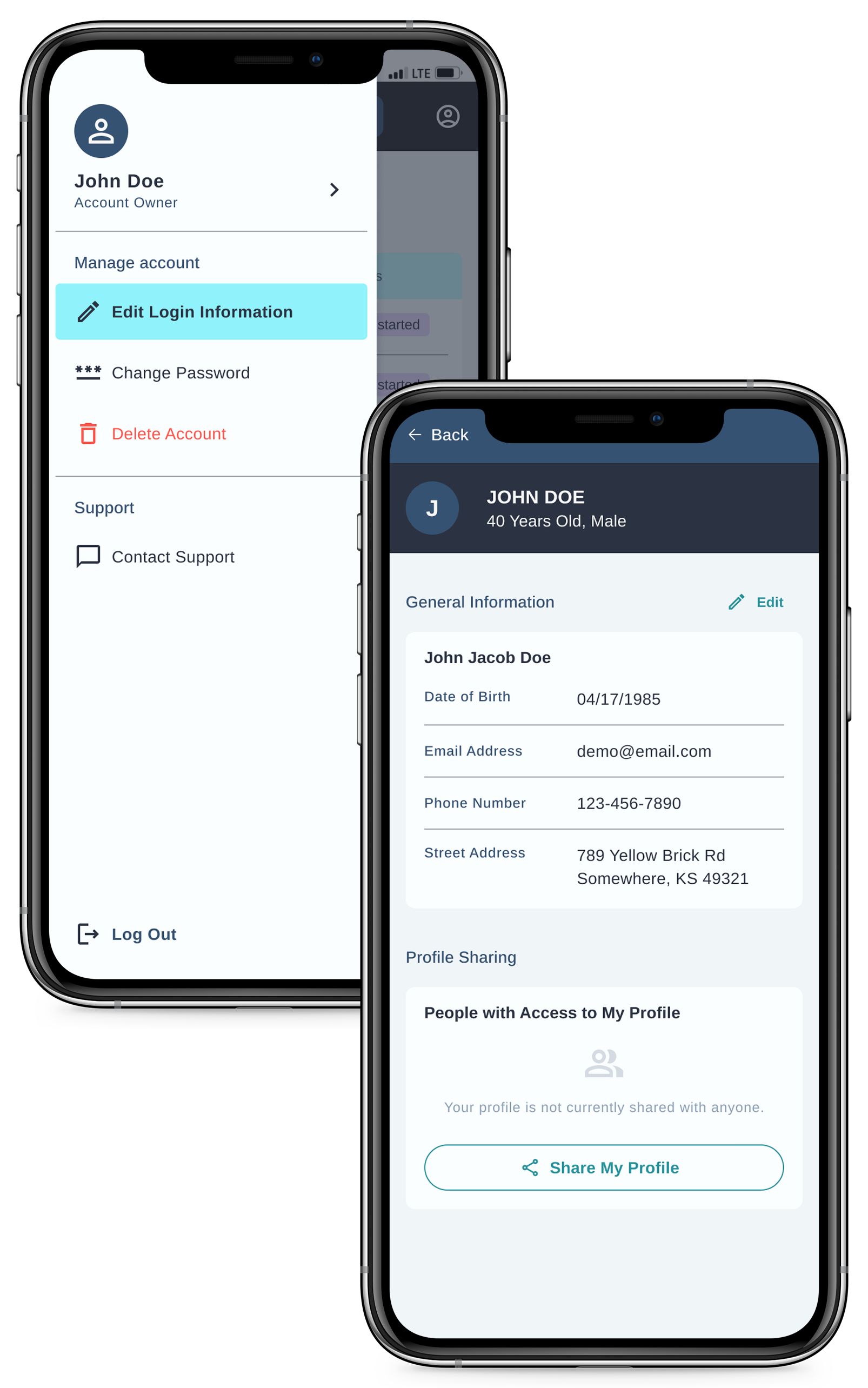
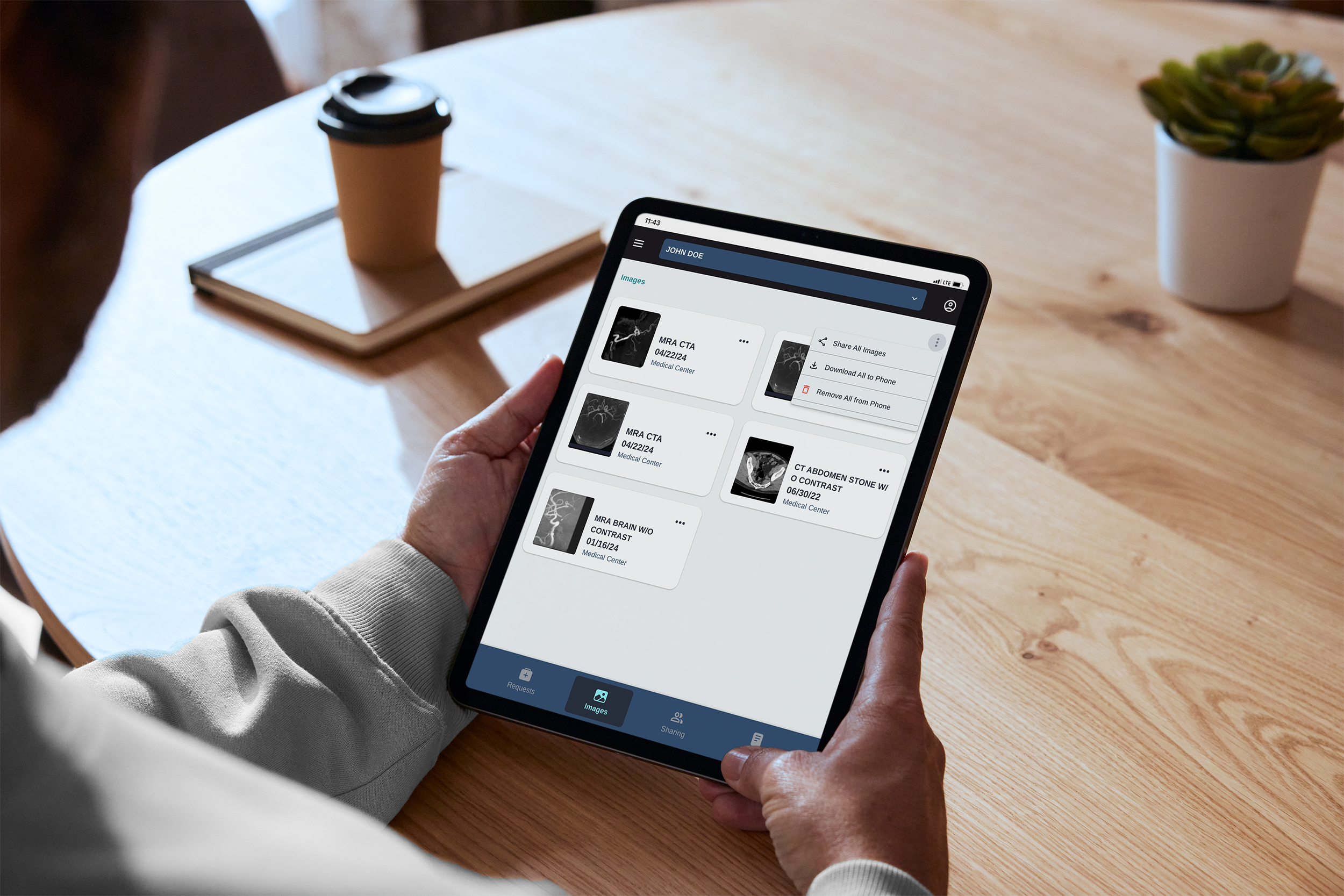
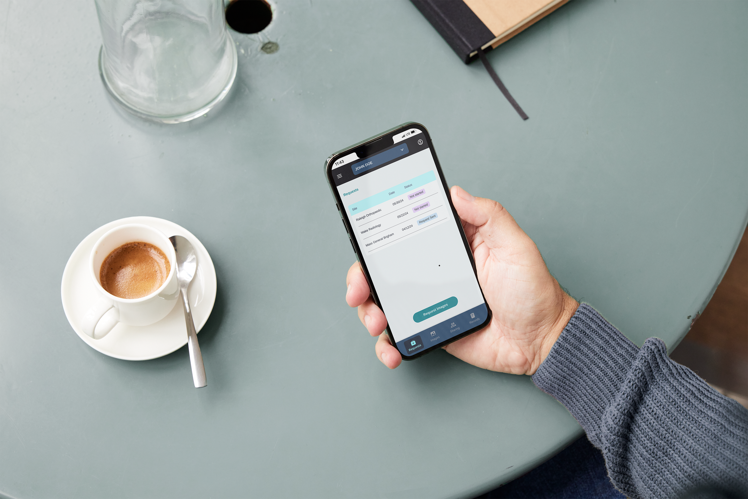
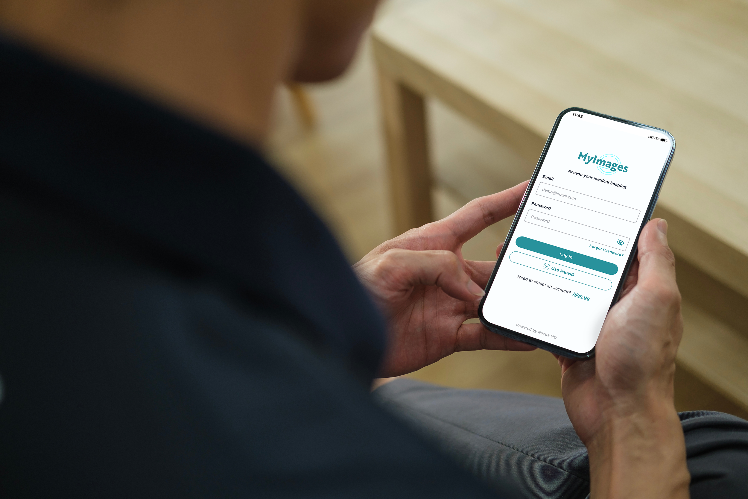
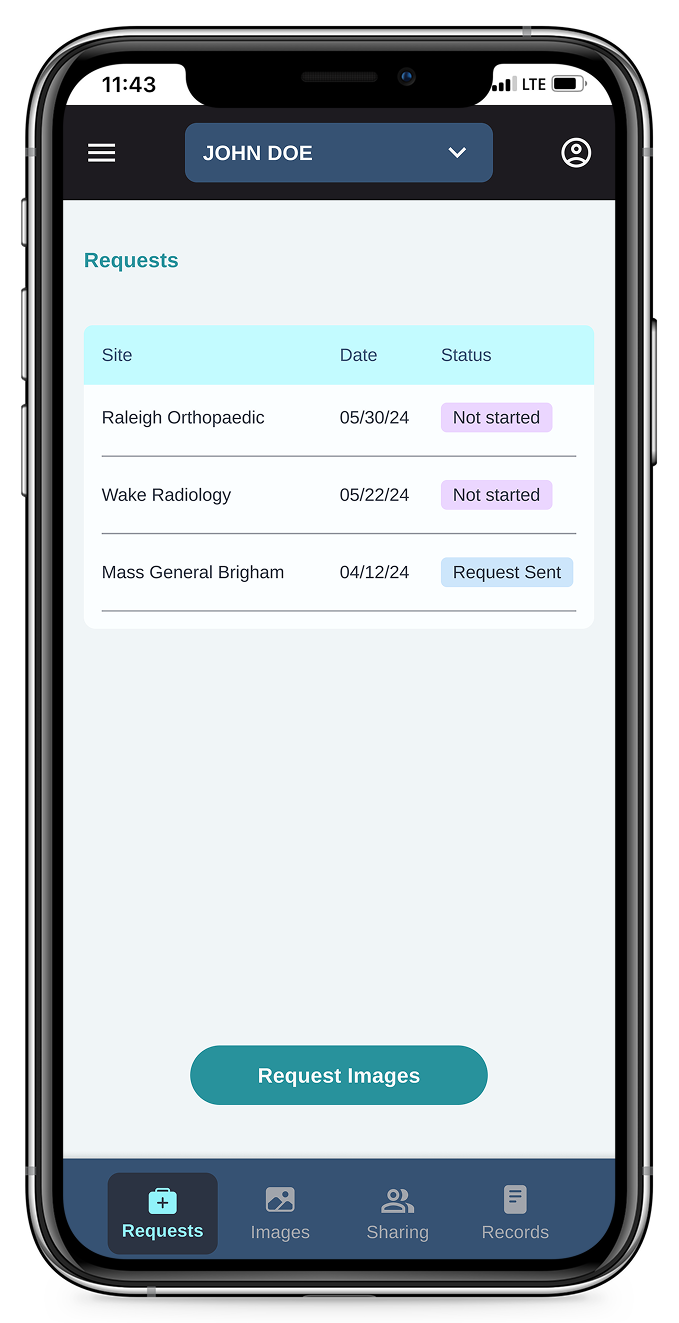
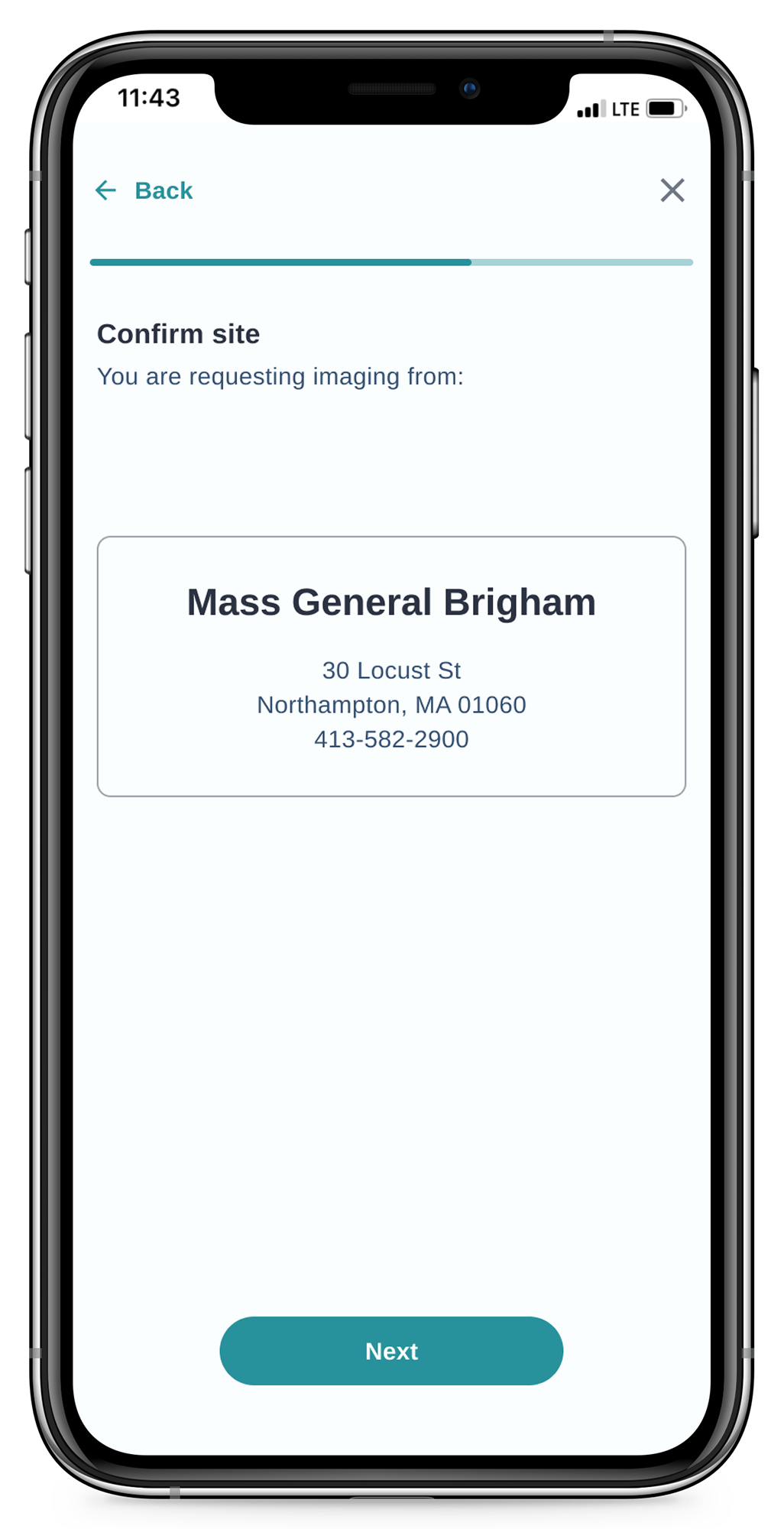
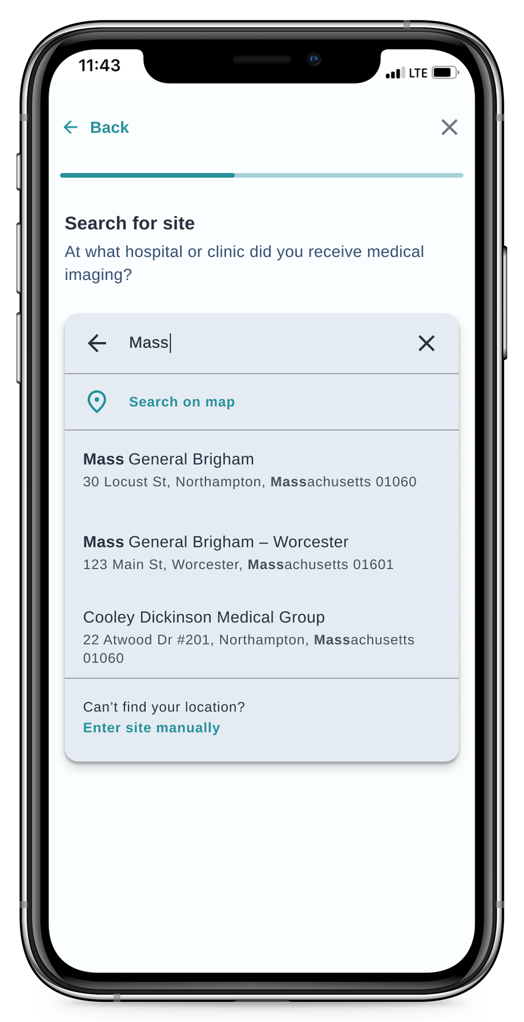
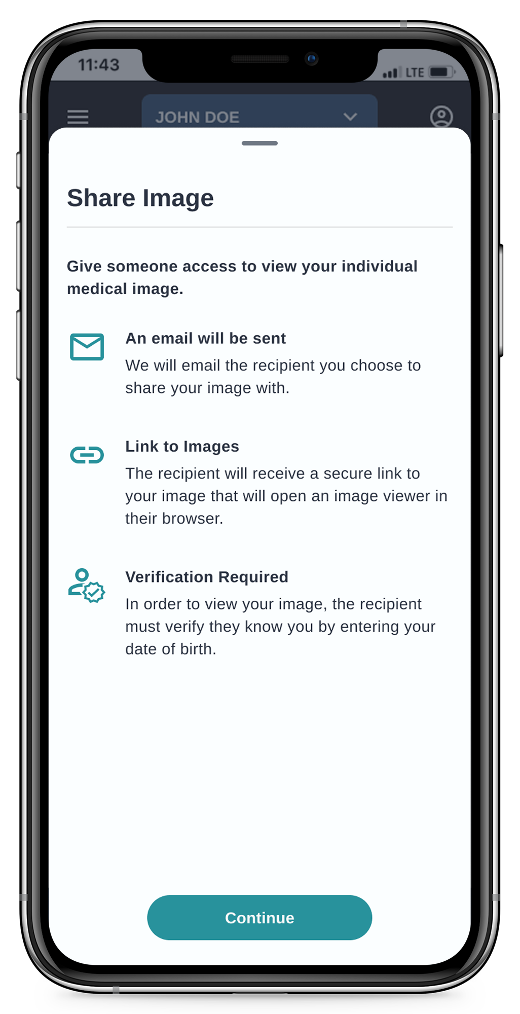
High-fidelity mockups with suggested changes to improve the usability and design of the current app.
Refreshed onboarding flow
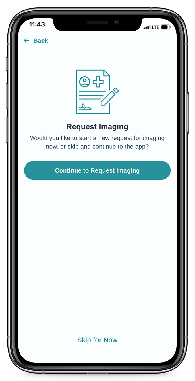
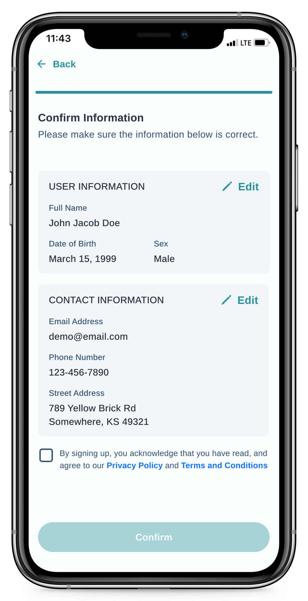
Request medical imaging
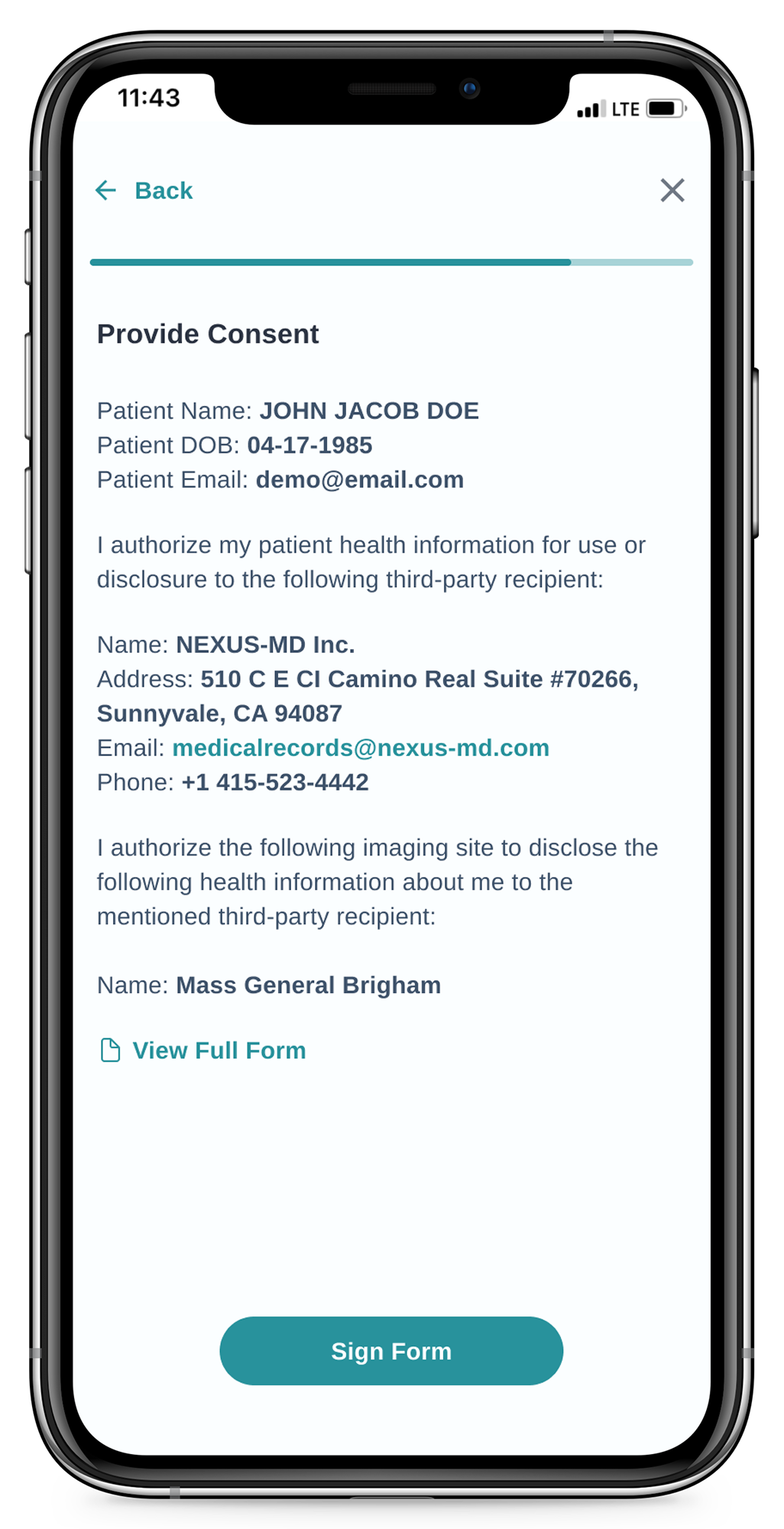
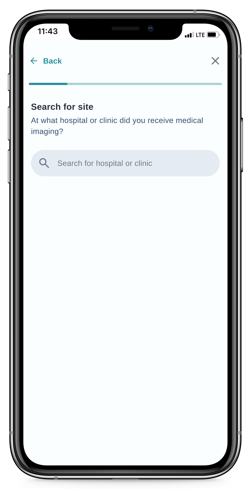
Share medical imaging
Medical records
Profile & account