Fit Flow App
Role
UI Designer
Scope
UI design, user research, visual design
Client
CareerFoundry
Timeline
2025
Overview & Content
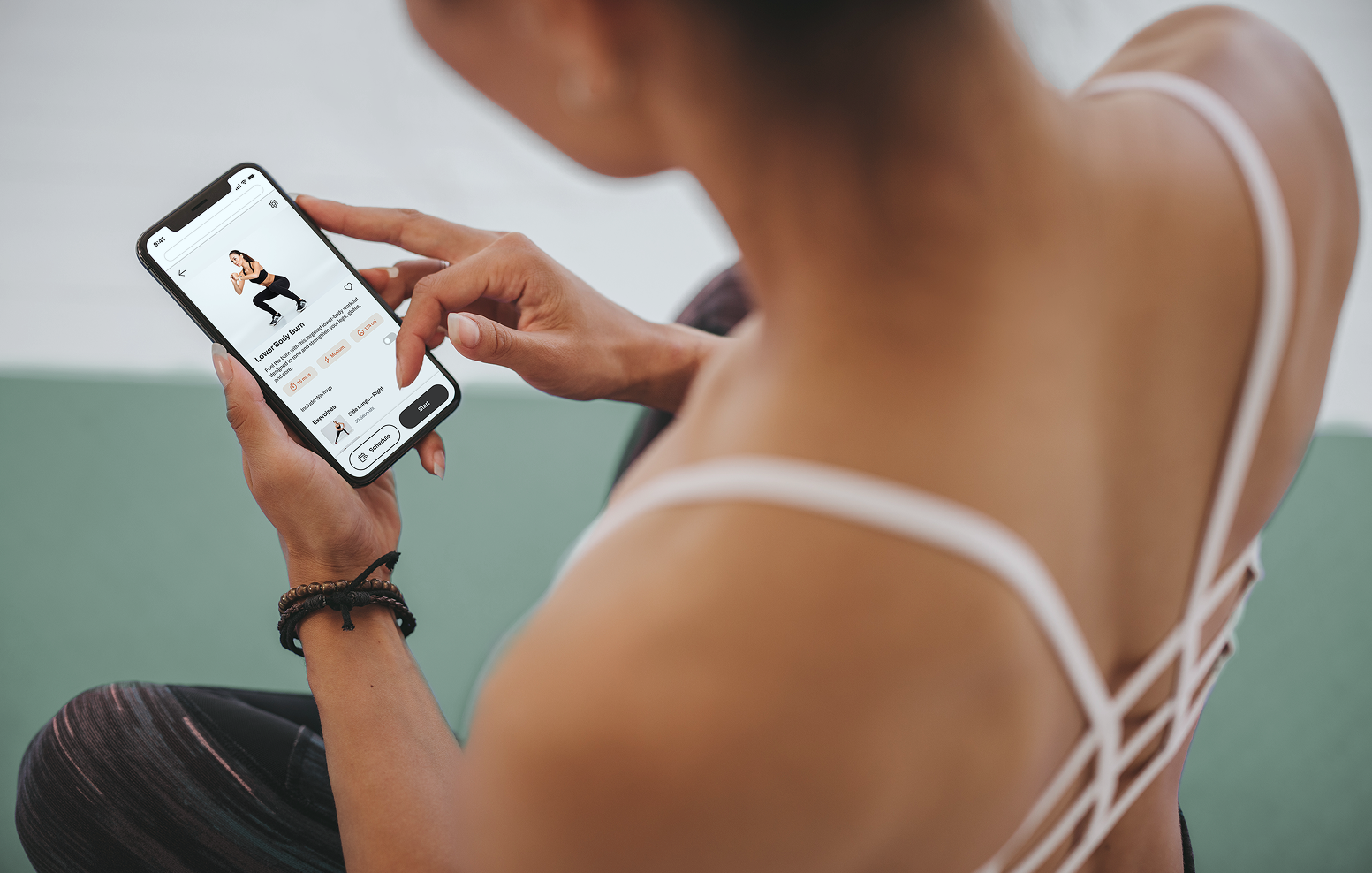
For this UI project, I designed a mobile fitness app aimed at beginners and those returning to exercise, creating a personalized experience that recommends activities based on each user's fitness level, schedule, and interests to make staying active feel achievable and enjoyable.
User Persona
1
Task Flows & Wireframes
2
Mid-Fidelity Mockups
3
Visual Direction & Style Guide
4
Final Product
5
User Persona

About
Rebecca: The busy mom seeking routine
Rebecca is looking for a fitness app that works with her busy schedule, goals, and current fitness level. She lives in an apartment with her boyfriend and 3-year old daughter. Rebecca has several friends from her software development job, and one of them recommended this tool as something she should check out to help her reach her goals.
Goals & Tasks
Lose weight and get in shape, as her sedentary job doesn’t allow a lot of time for exercising.
Find a tool that will help in fitting exercise routines into her busy schedule.
As a beginner, learn how to exercise properly.
Get help finding enjoyable, motivating routines.
Task Flows & Wireframes
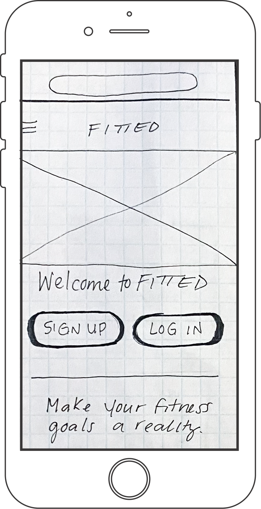
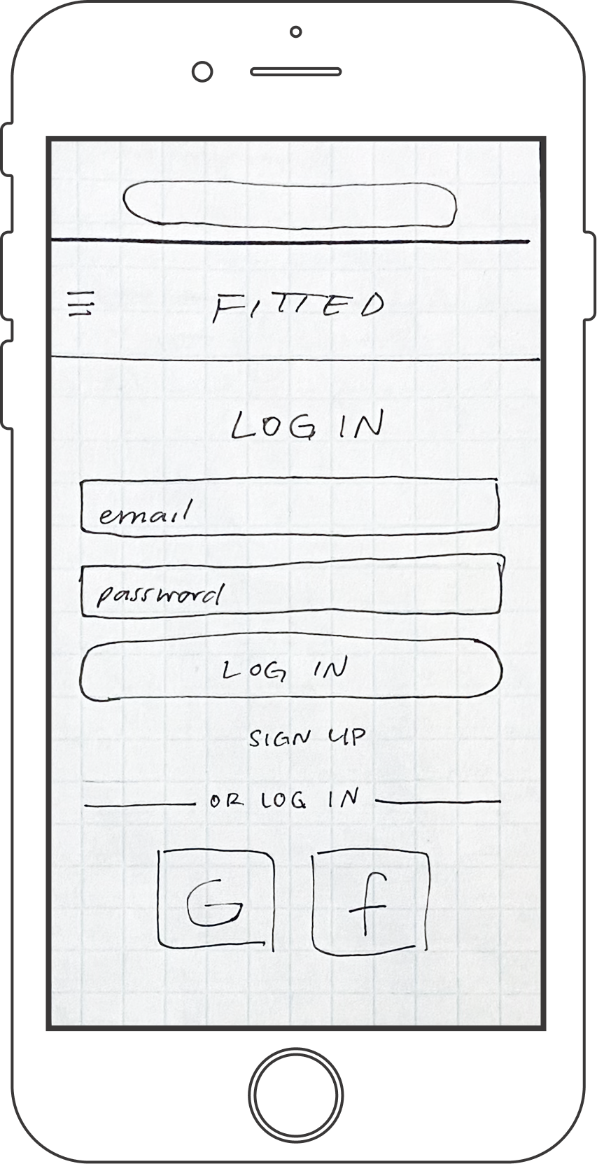
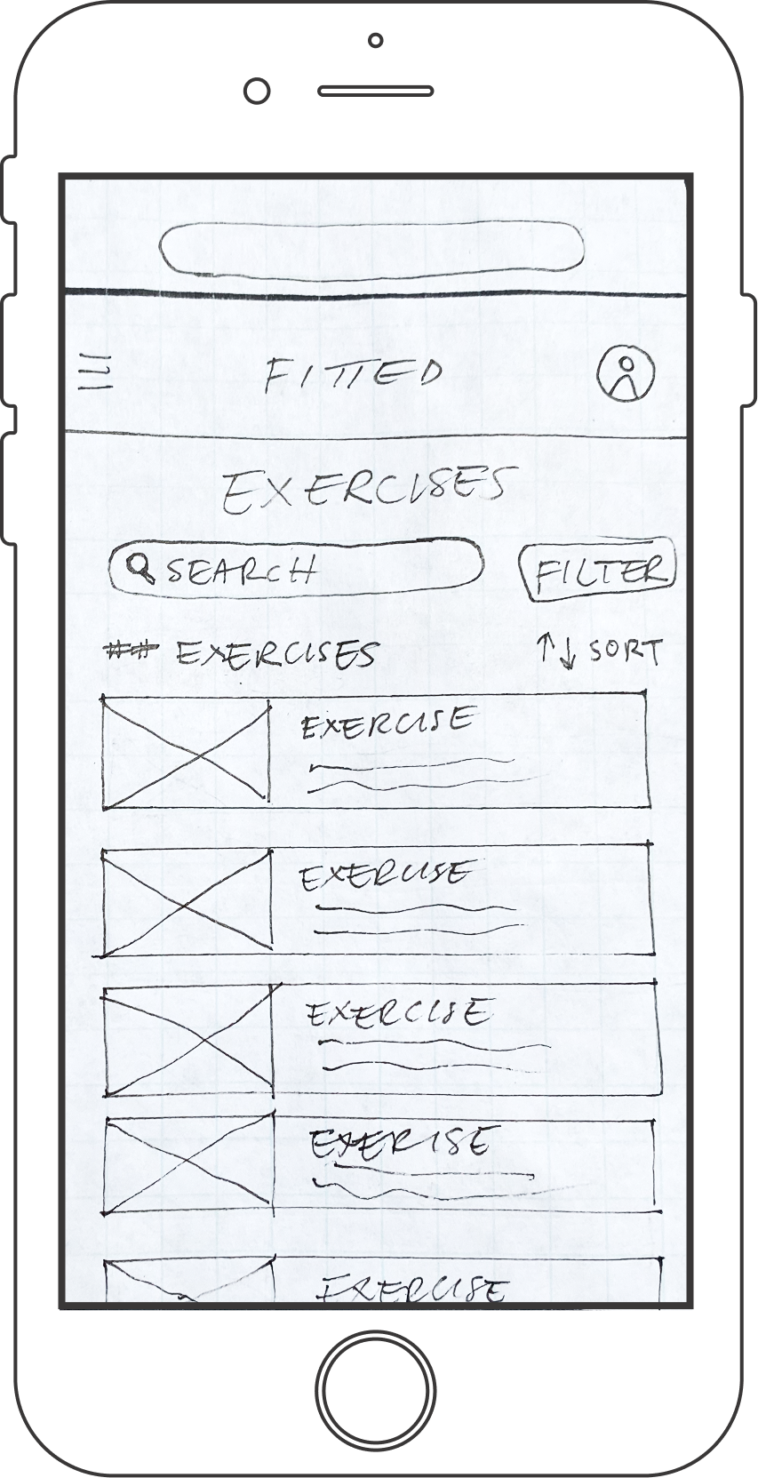
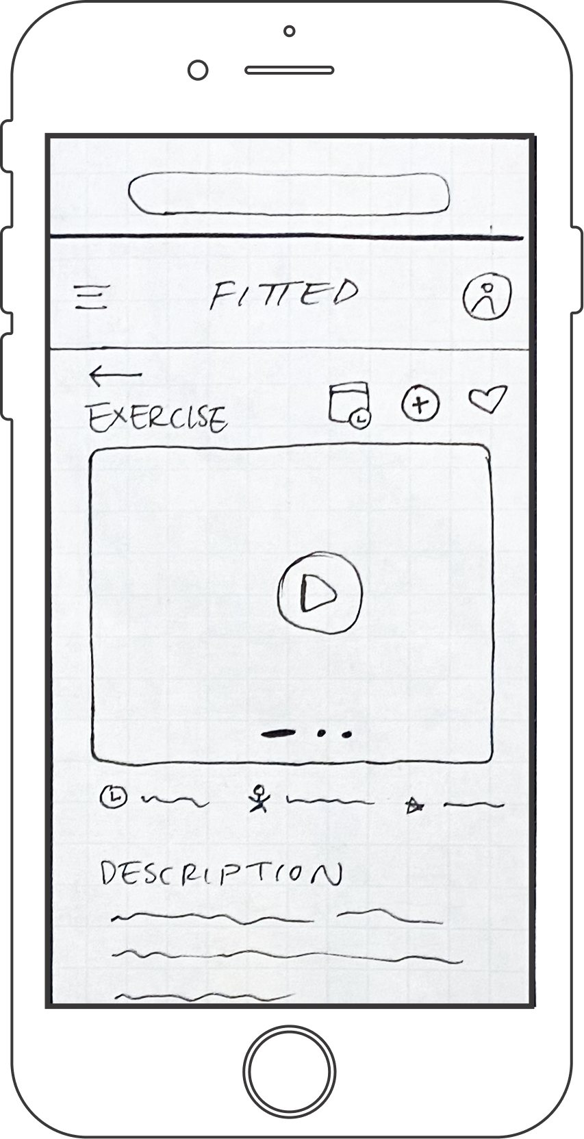
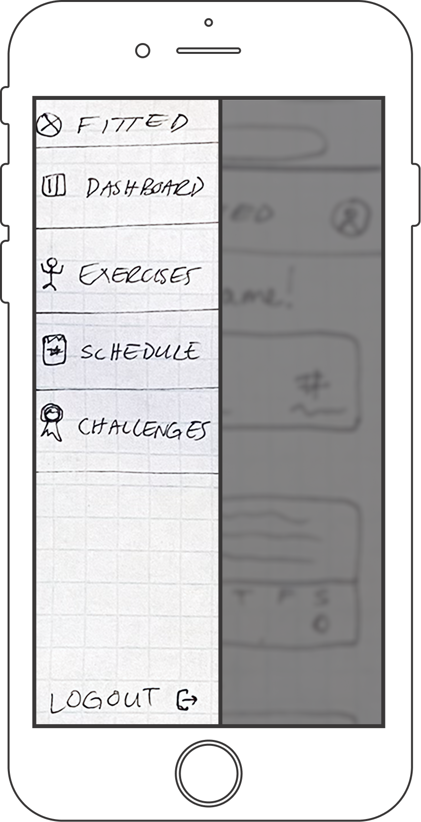
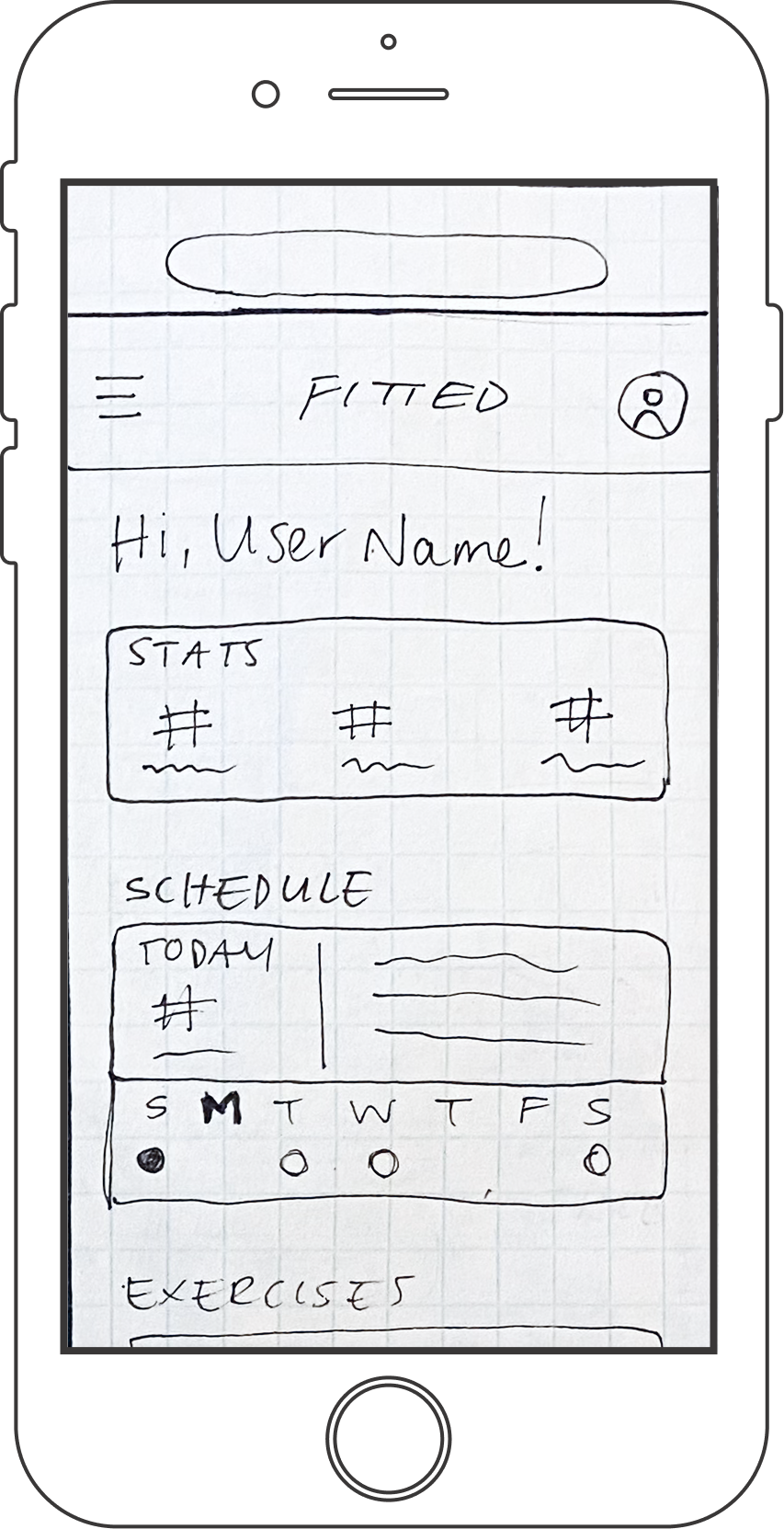
After familiarizing myself with our user persona, I outlined the tasks as a way of keeping those goals in mind, and to inform the wireframe sketches and app design.
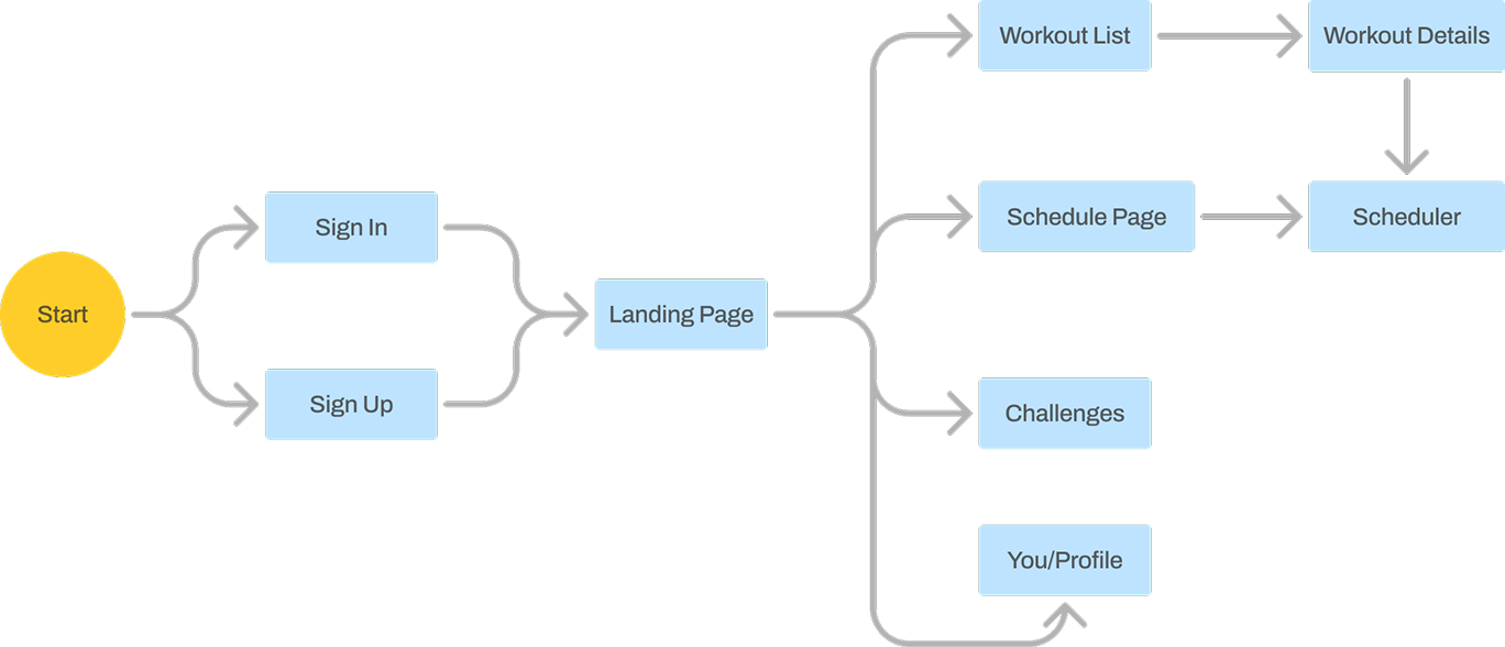
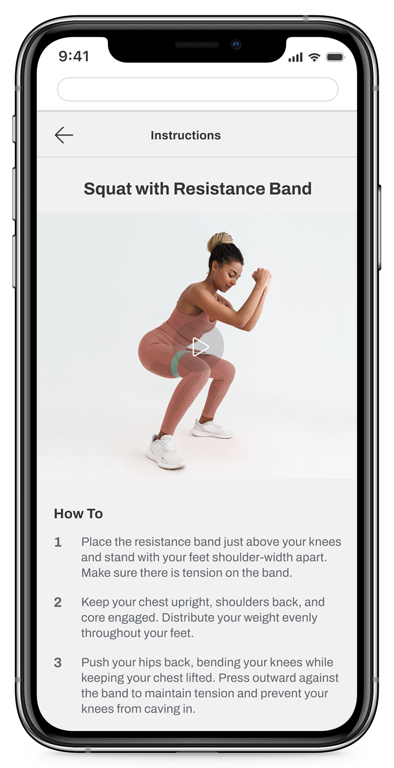
Task 1: Learn How to Do Exercises
“As a new user, I want to be shown how the exercises are done, so that I know I’m doing them correctly.”
Task 2: Schedule Exercises
“As a frequent user, I want to be able to schedule exercises for working out, so that I build positive habits.”
Task 3: Earn Rewards/Achievements
“As a frequent user, I want to be able to earn achievements or rewards, so that I can stay motivated.”
Mid-Fidelity Mockups
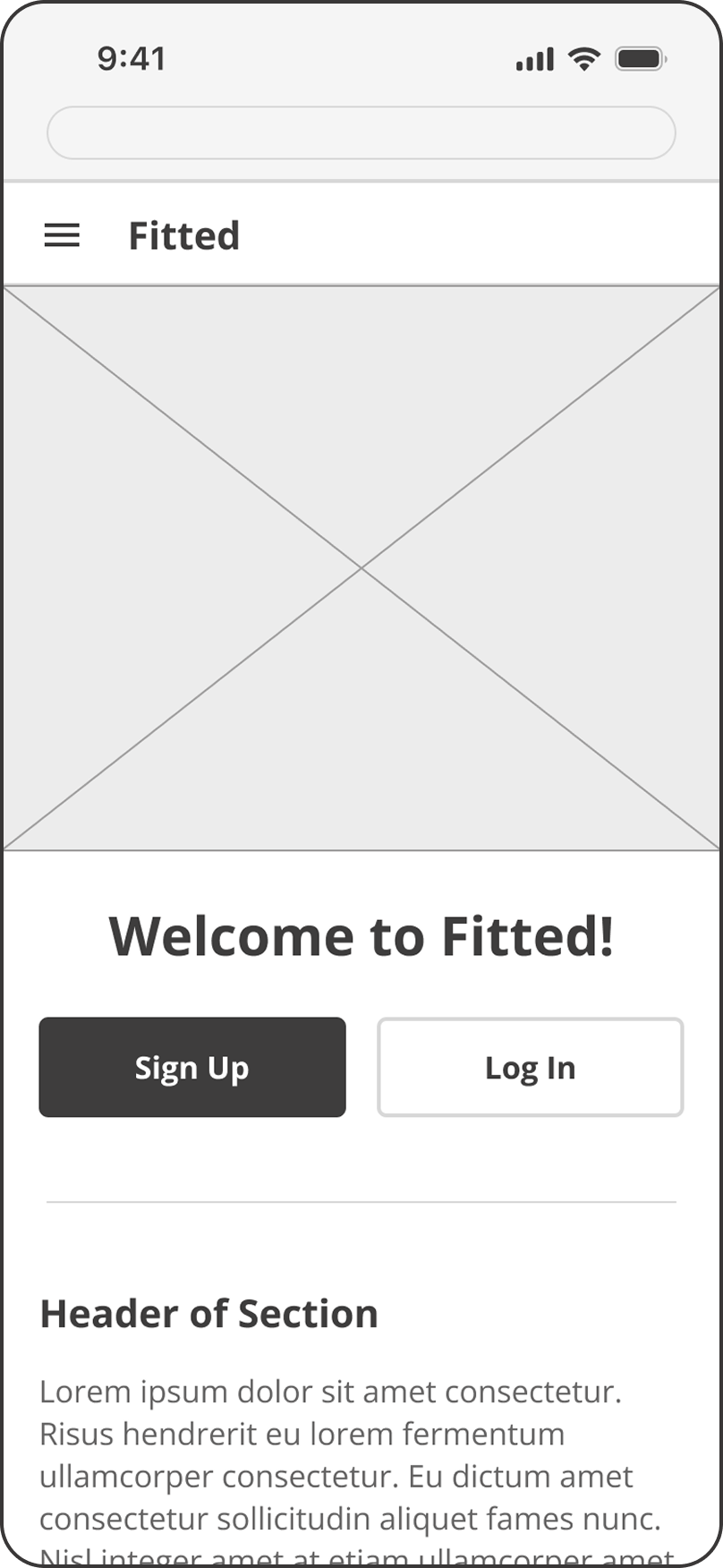
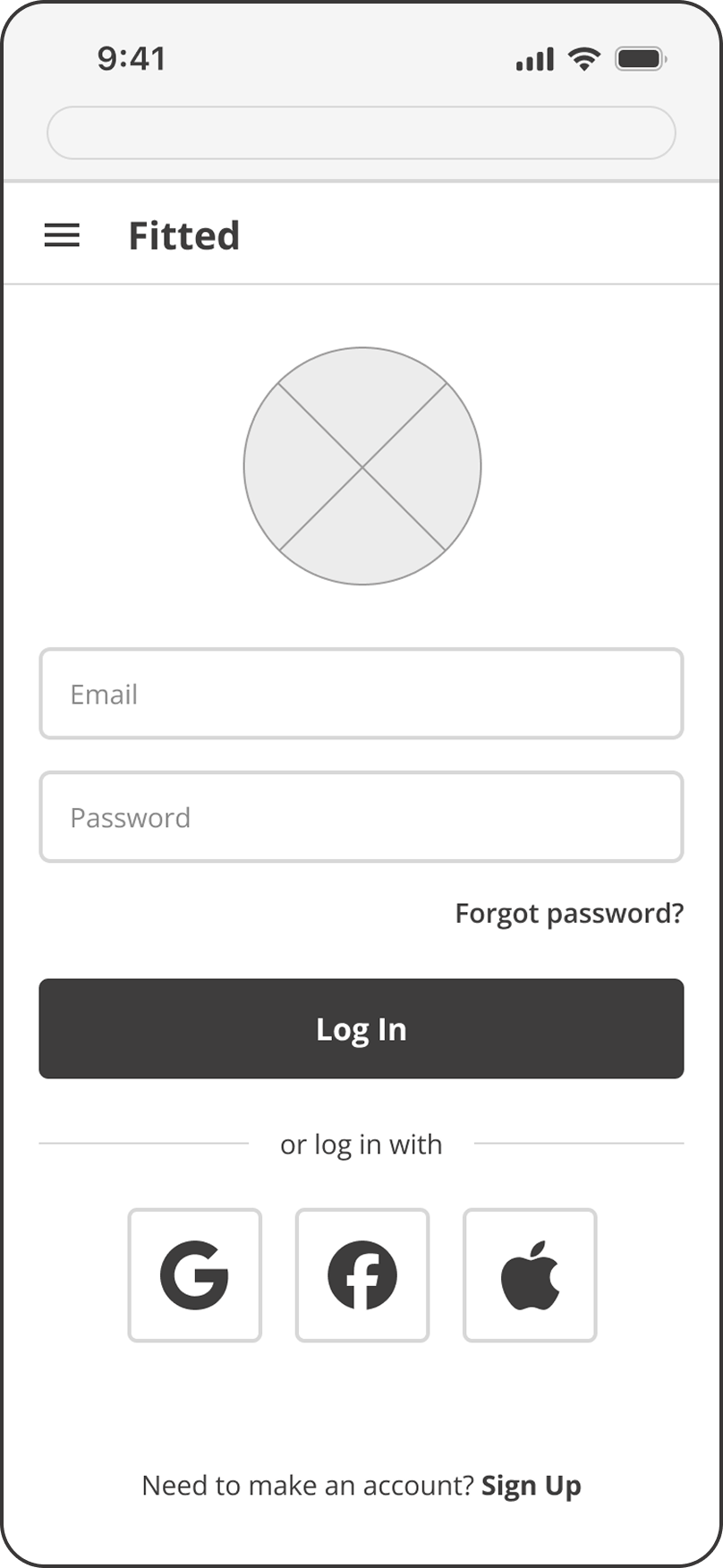
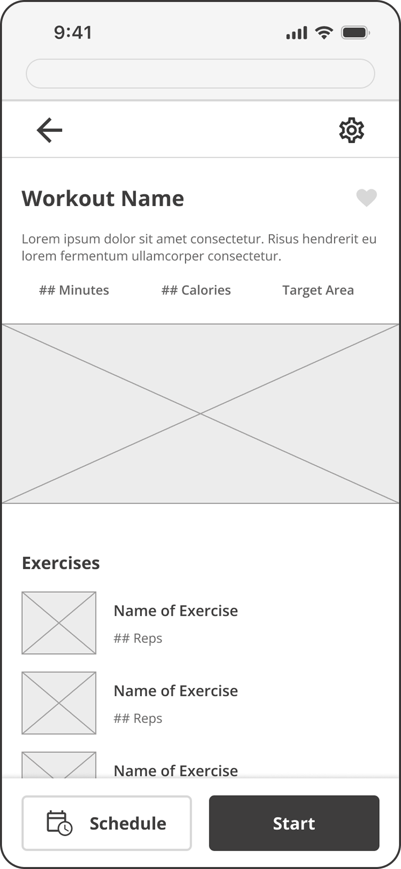
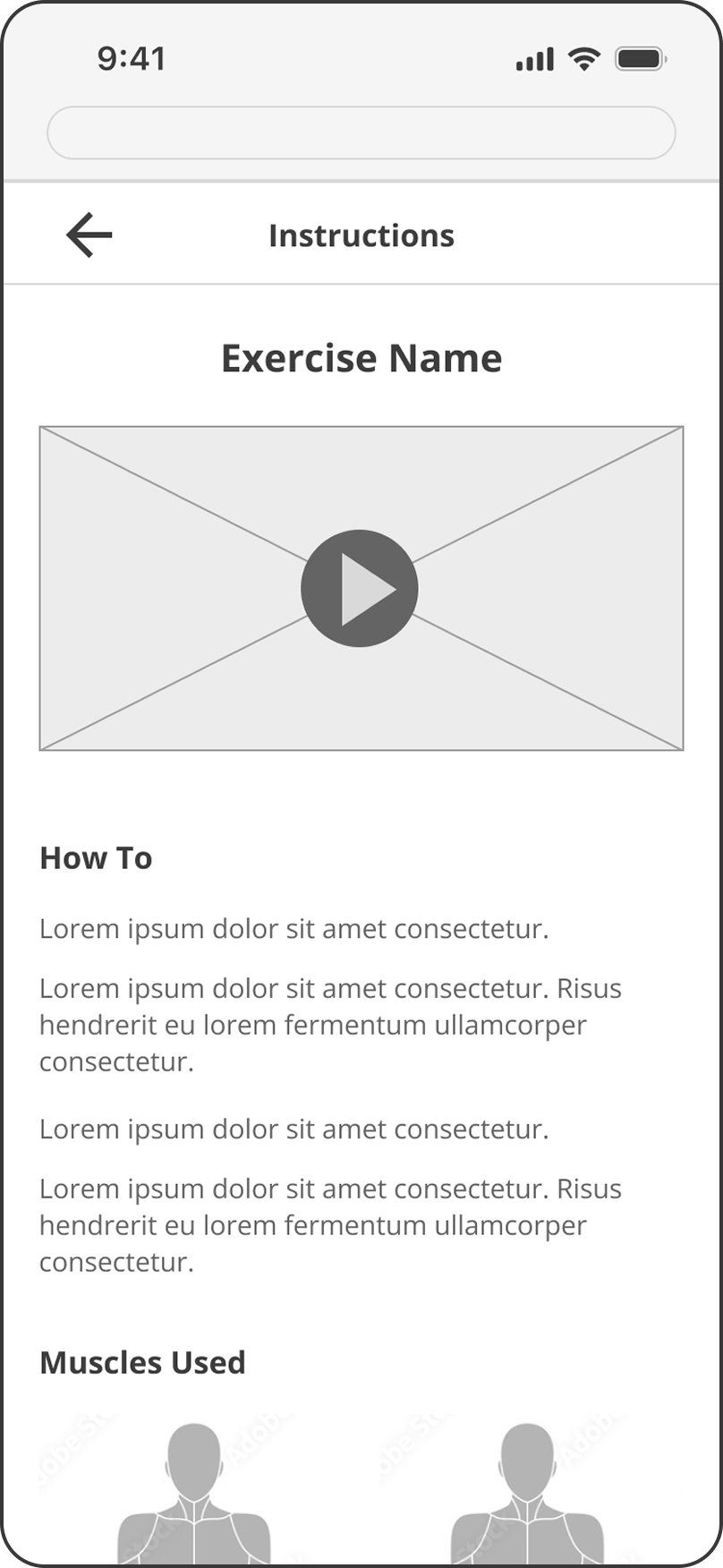
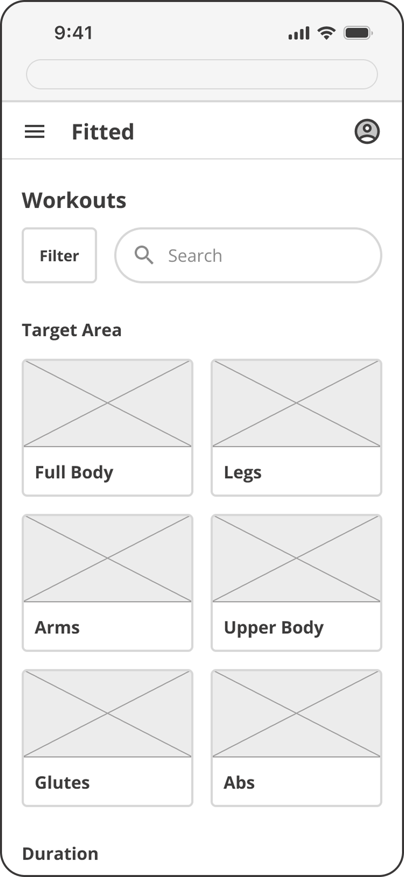
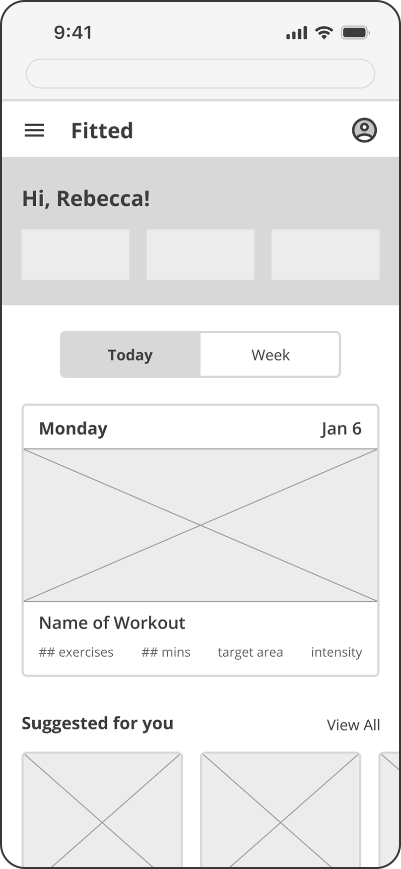
After sketching the initial wireframes, I began arranging the screens with component and text placeholders. Applying these elements across pages helped provide a foundation for a consistent layout throughout the app.
Landing Page
Login
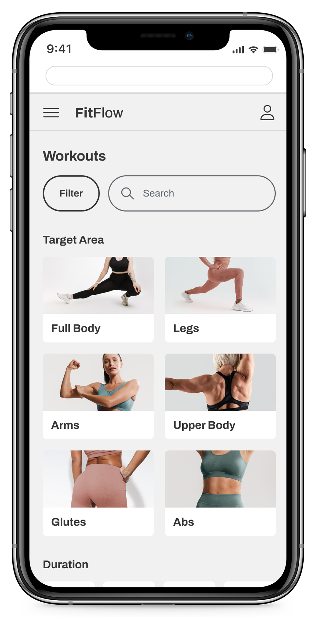
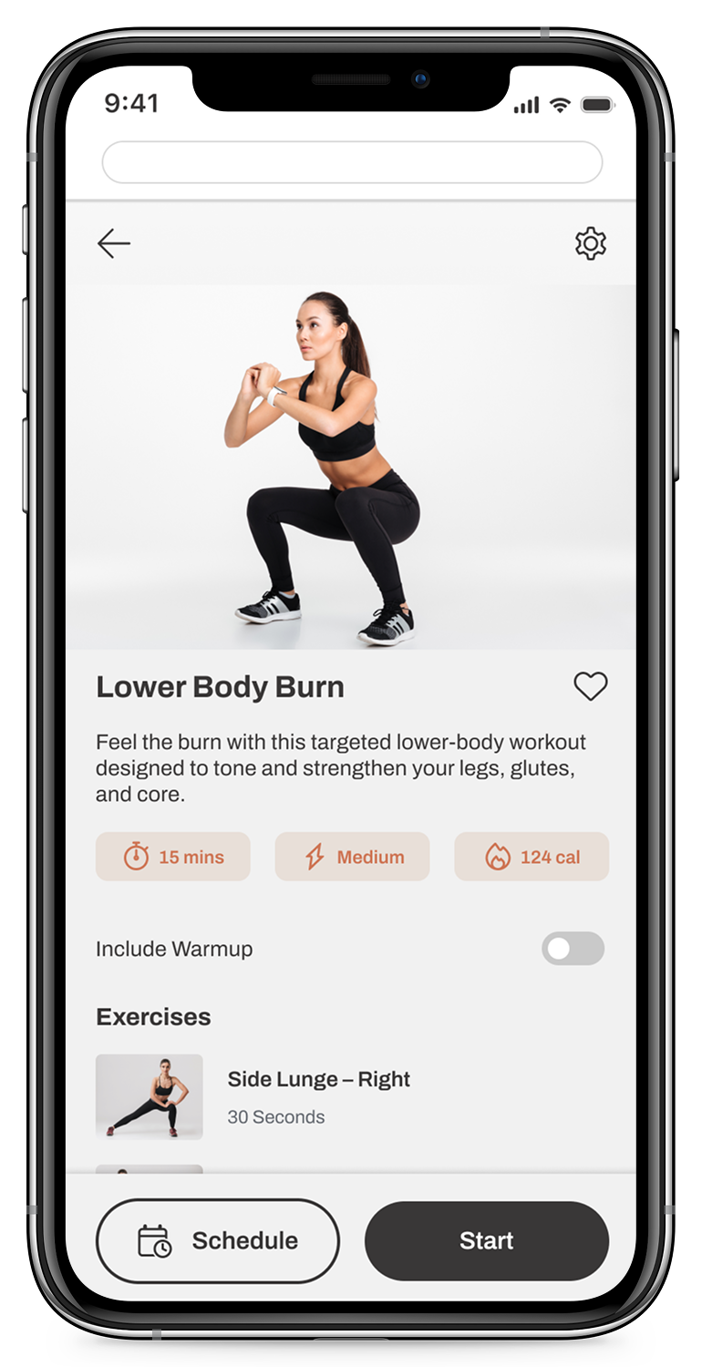
Workout Page
Exercise Details
Workout List
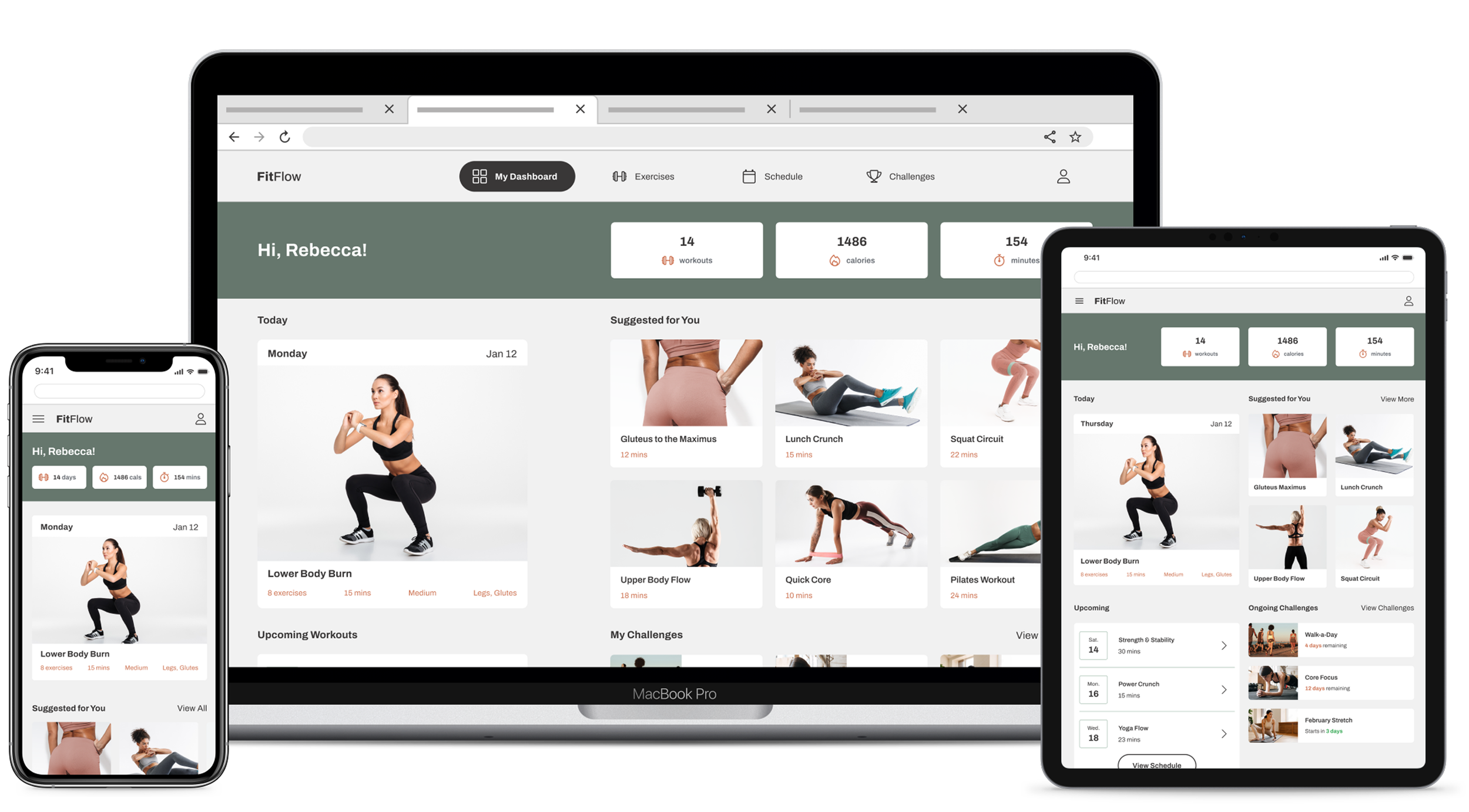
Home
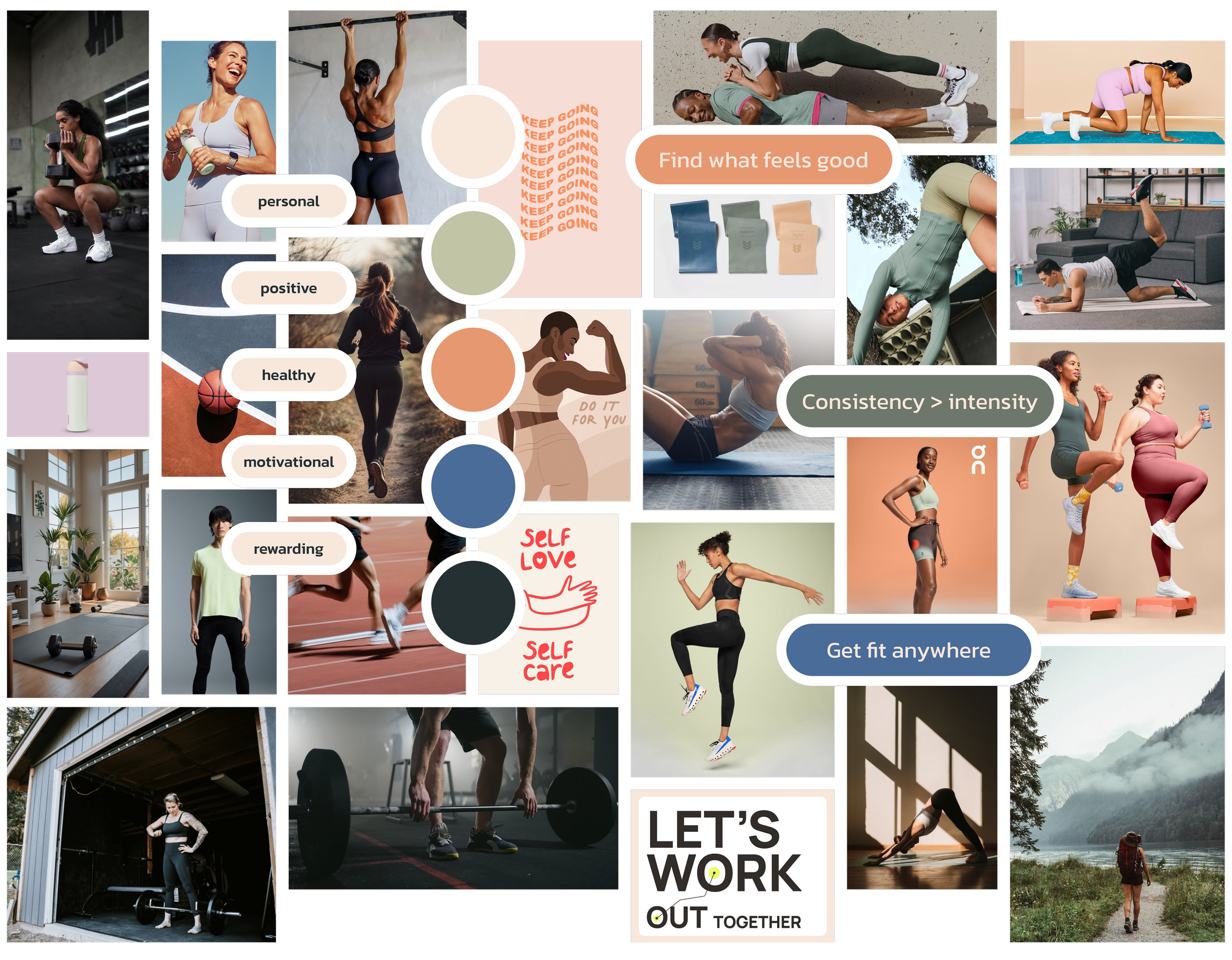
Visual Direction
I chose an Aspirational Wellness aesthetic that balances expertise with approachability for beginners like Rebecca. Muted, neutral colors and photography featuring diverse body types create a welcoming, relatable experience, and a clean, organized interface provides a sense of calm amid the chaos of everyday life.
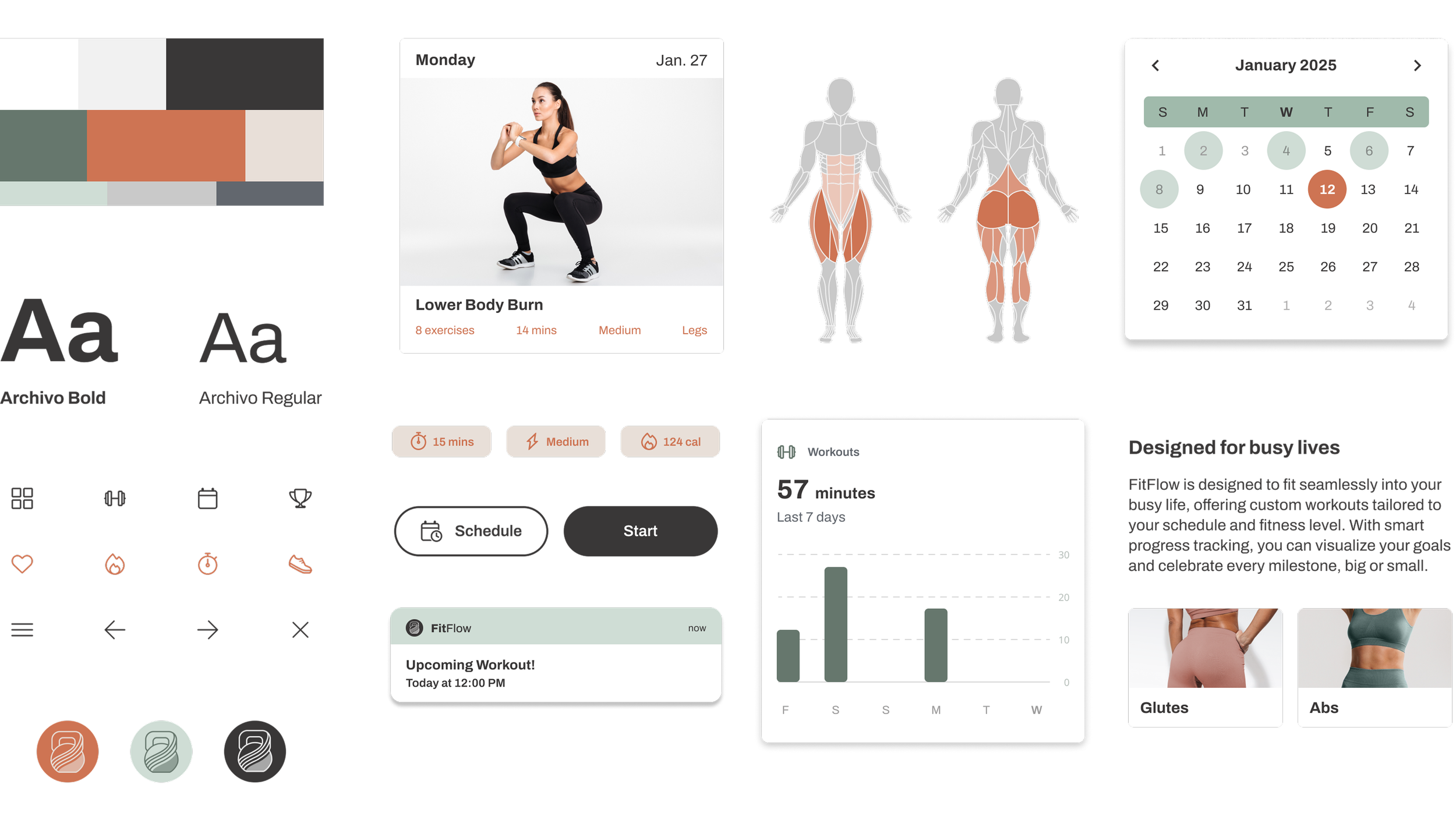
Style Guide
To align with the desired mood and brand, I selected muted natural tones and a legible sans-serif font to be applied throughout the app.

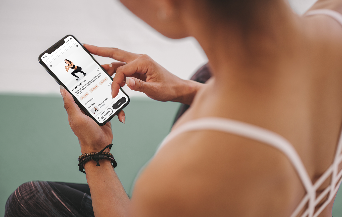
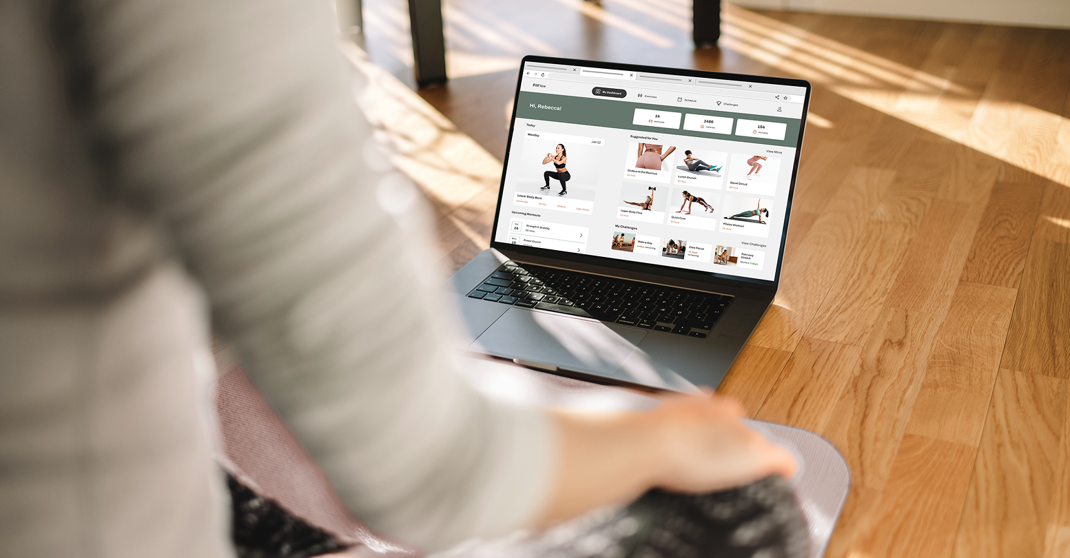
View workouts and helpful how-tos
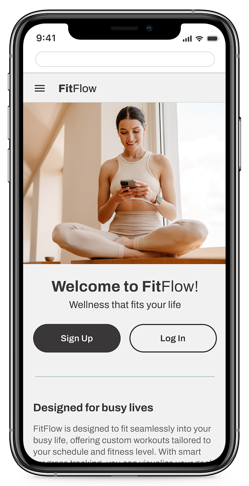
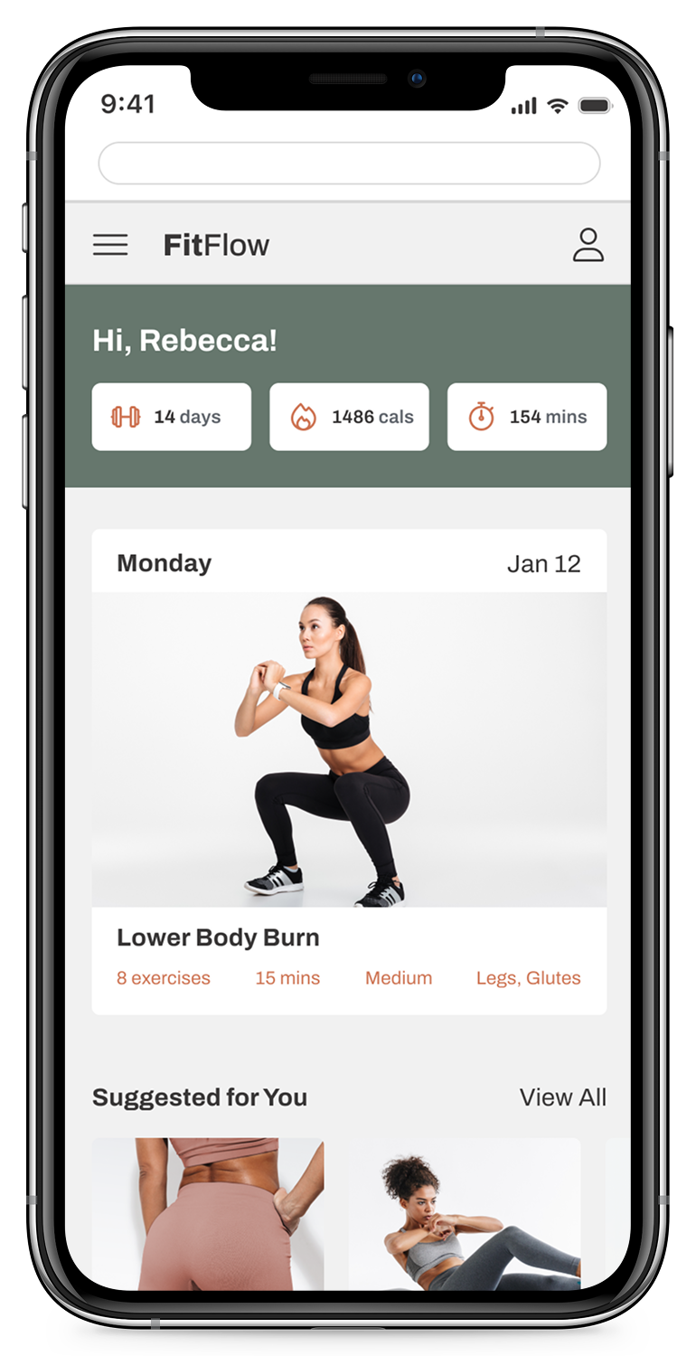
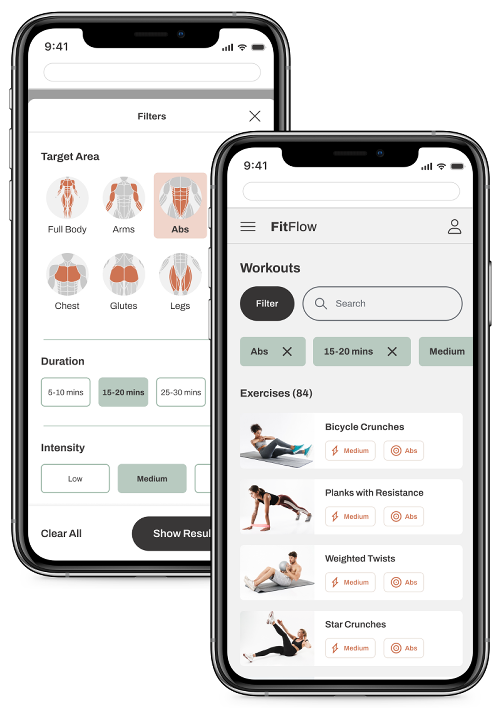
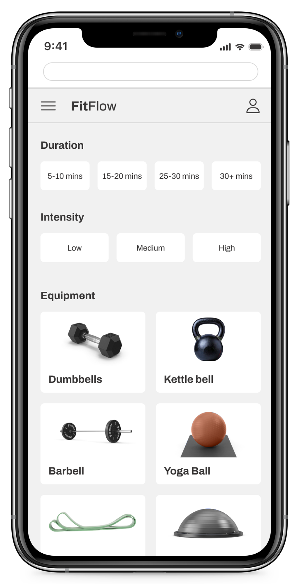
Filter and find workouts based on preferences